ListItem.Accordion
This allows making a accordion list which can show/hide content.
Usage
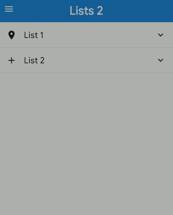
<ListItem.Accordion
  content={
    <>
      <Icon name="place" size={30} />
      <ListItem.Content>
        <ListItem.Title>List Accordion</ListItem.Title>
      </ListItem.Content>
    </>
  }
  isExpanded={expanded}
  onPress={() => {
    setExpanded(!expanded);
  }}
>
  {list2.map((l, i) => (
    <ListItem key={i} onPress={log} bottomDivider>
      <Avatar title={l.name[0]} source={{ uri: l.avatar_url }} />
      <ListItem.Content>
        <ListItem.Title>{l.name}</ListItem.Title>
        <ListItem.Subtitle>{l.subtitle}</ListItem.Subtitle>
      </ListItem.Content>
      <ListItem.Chevron />
    </ListItem>
  ))}
</ListItem.Accordion>
Props
note
Includes all ListItem props.
| Name | Type | Default | Description |
|---|---|---|---|
animation | Animated.TimingAnimationConfig | Object with duration 350ms and type timing | Decide whether to show animation. |
content | ReactNode | Similar to ListItem's child. | |
expandIcon | IconNode | Icon when Accordion is expanded, if not provided icon will be rotated 180deg. | |
icon | IconNode | Icon for unexpanded Accordion. | |
isExpanded | boolean | Decide if Accordion is Expanded. | |
noIcon | boolean | Don't show accordion icon. | |
noRotation | boolean | Don't rotate when Accordion is expanded. |