React Native Elements v4 introduces many features including few new components, fully typescript support and some breaking changes whose migration is being given below.
Migration Guide
Refer the migration guide to migrate from v3 to v4.


Refer the migration guide to migrate from v3 to v4.

Organization: React Native Elements
Project: Migrating Hooks, Tests & APIs
Mentors: Jeremy Hamilton, Pranshu Chittora, Dhruvdutt
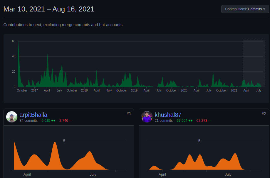
Student: Arpit Bhalla
The Google Summer of Code 2021 has been a fantastic and cheerful learning experience for me over the past few months. I have learned a lot from the community, especially how to organize commits and write readable code. React Native Elements is an amazing community to work with, as mentors are really helpful and experienced. I had started contributing to React Native Elements from March 2021 and till now, I have 40+ commits (10,803 additions and 13,826 deletions) merged. Over the past few months, I had great exposure writing maintainable code, communicating with the mentors, etc. I had completed some of my work in the coding period started as some issues mentioned in my proposal had a high priority for the release.
Pressable API (#3170)
Pressableis preferred toTouchablecomponents according to React Native official docs.Pressablecomponent offers a more extensive and future-proof way of handling the touch-based inputs.
Touchable Component:
Pressable Component:
Pressable contains a lot of new props and cool features such as:
delayLongPress: Duration in milliseconds from onPressIn by the time onLongPress is called.Reference : Pressable vs. Touchable in React Native
Rather than tests focusing on the implementation (Enzyme), tests are more focused on user behavior (react-native-testing-library).
Enzyme allows us to access the internal workings of your components. You can read and set the state, and we can mock children to make tests run faster. On the other hand, RN testing-library doesn't give us any access to the implementation details. It renders the components and provides utility methods to interact with them. The idea is that you should communicate with our application in the same way a user would. So rather than set the state of a component we reproduce the actions a user would do to reach that state.
Some components like Image, ToolTip which further include SearchBar android & SearchBar iOS were Class Components and the code was messy, These are migrated to Functional Components and added hooks like, useState, useEffect, useCallBack, which would increase performance.
You can find all my contributions here
It helps user to test the component from documentation
Auto imports components and auto complete syntax with component preview for React Native Elements.
Stack ComponentStack is concerned with one-dimensional layouts. This is not yet in the priority but it would help developers.
Example
<Stack spacing={2}>
  <Item>Item 1</Item>
  <Item>Item 2</Item>
  <Item>Item 3</Item>
</Stack>

Automatically generate documentation out of React/React Native Component
This summer, I was pleased to get selected for Google Summer of Code'21 under the organization React Native Elements. Working under the organization, my project was to generate documentation automatically out of the UI components and present it in the Docusaurus website.

The purpose of creating this repository is to maintain a report summary of my GSoC work and this may also serve as a guide for future GSoC aspirants and a reference to the developers and contributors to the project.
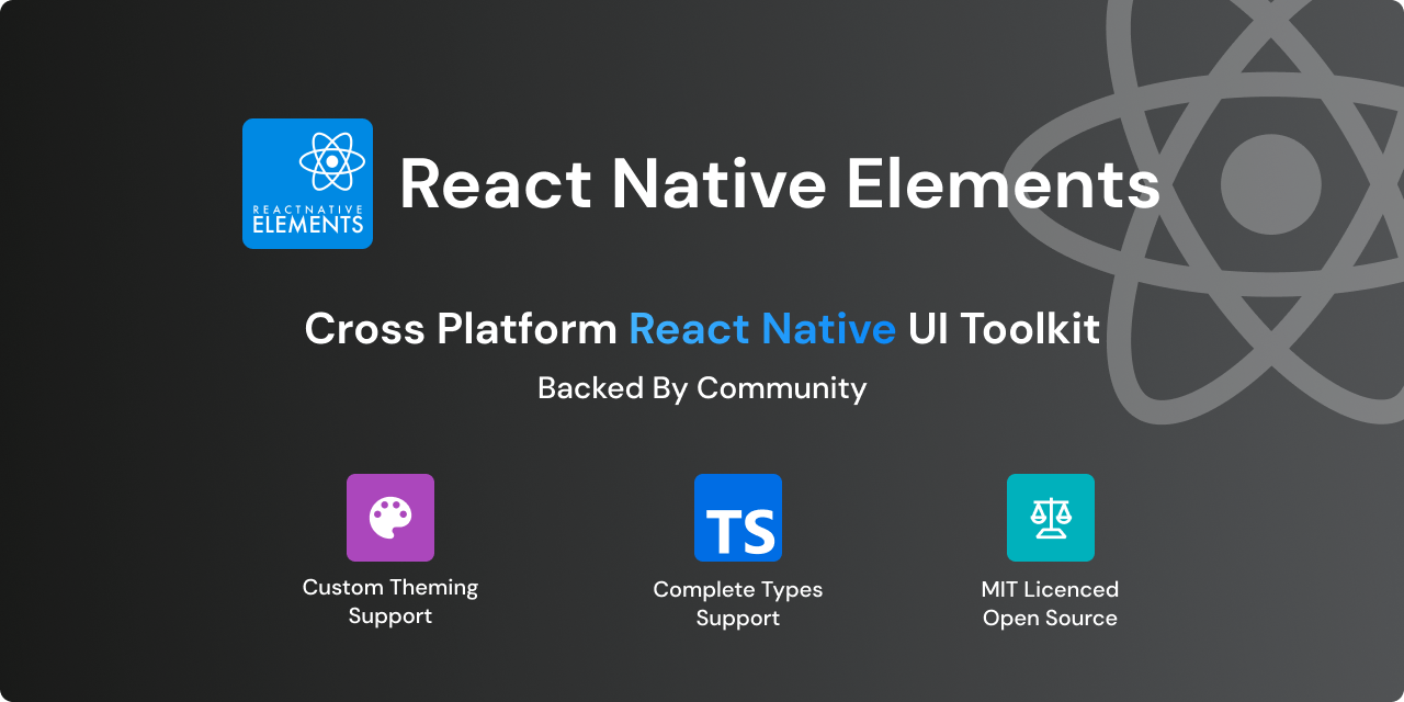
React Native Elements is a cross-platform UI toolkit built on/for React Native. With a weekly download by 90k+ users and backed by a huge community, it provides UI components that can be used in your native application for the platform of Android/iOS/Web.
The documentation of the project was maintained manually previously i.e., suppose I want to change/add/remove a prop or a new component to the project the markdown file had to be changed manually. The process is tiring and new contributors may often forget to do so. So, during the summers I took the change this process and make a workflow such that the generation is automatic. This should be fast and maintainable.
The deliverables of the project are as follows:
All of the listed deliverables were completed within the GSoC period. 🎉
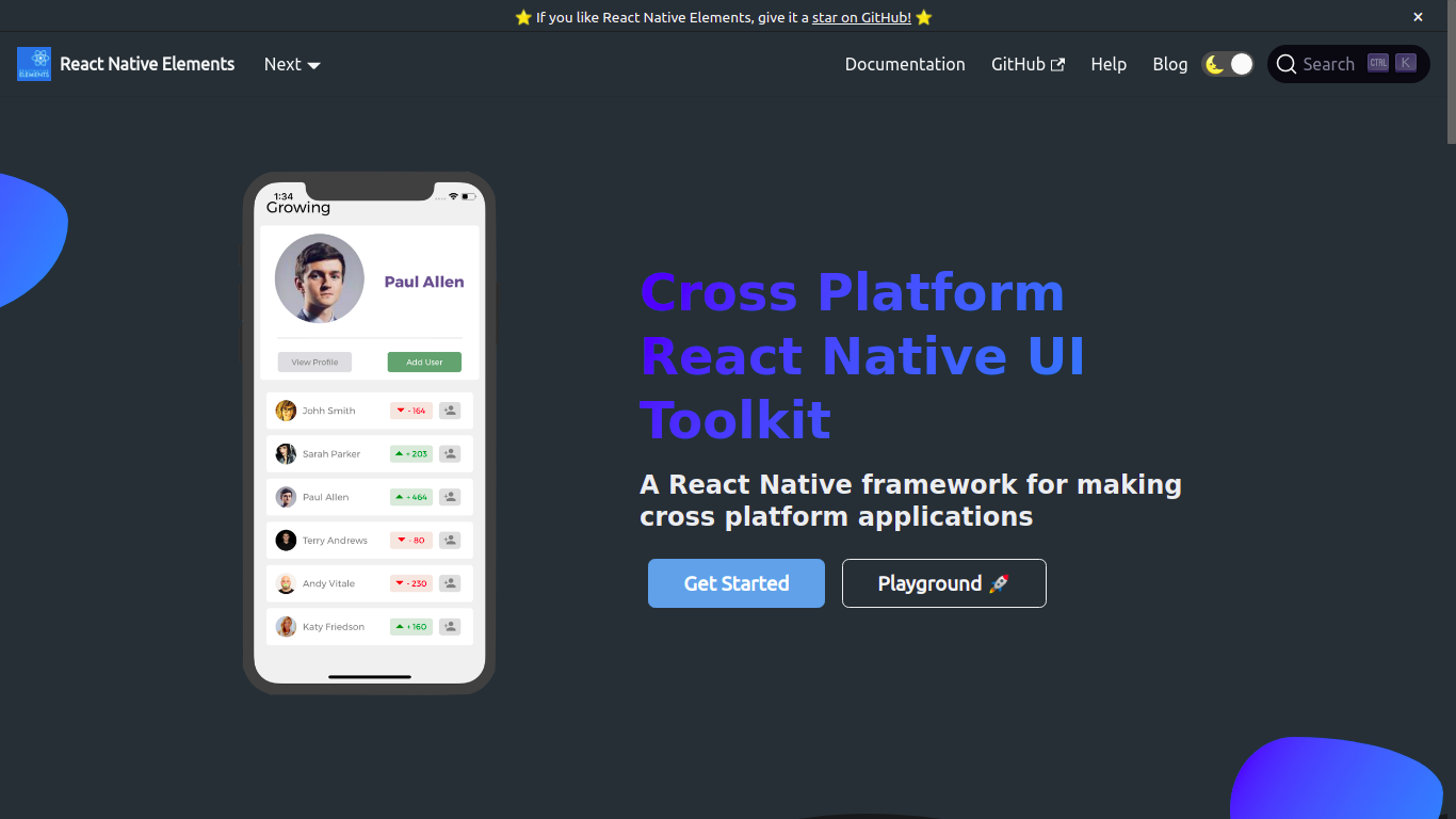
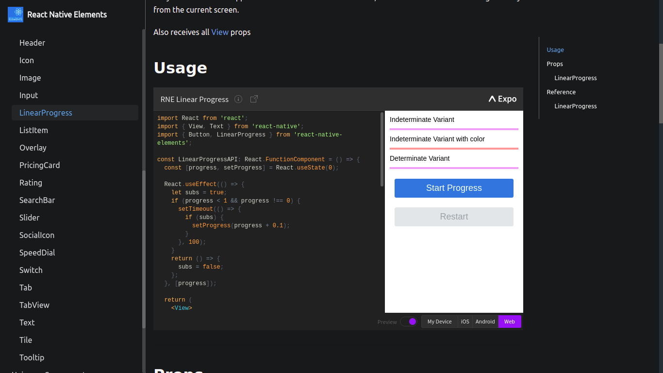
The work can be found here - Official Website of React native elements. Please refer to the component docs.
I have also written a blog on how it works attached here.
| PR Link | Description | Status |
|---|---|---|
| #3071 | [Refactor] Documentation directory structure | Merged ✅ |
| #3081 | [Refactor] Directory structure of components | Merged ✅ |
| #3112 | [Add] props description, descriptions to the component. | Merged ✅ |
| #3126 | [Docs] Added demos and snack for the documentation | Merged ✅ |
| #3136 | [Add] Docgen auto generation of docs scripts | Merged ✅ |
| #3142 | [Docs] Added generate-markdown scripts | Merged ✅ |
| #3143, #3144 | [Fix] Issues related to auto-generation of documentation | Merged ✅ |
| #3145 | [Fix, Improve] Doc-gen issues and automation | Open(to be merged) 🕒 |
| Issue link | Description |
|---|---|
| #3171 | [Docs] Auto-generation of documentation for class based components |
Apart from these contributions, I have contributed to other React native elements projects. They can be summarized as:
| Project | Reference |
|---|---|
| React Native Elements - main repo | Pull requests |
| React Native Elements App | Pull requests |
| Playground | Pull requests |
I would like to thank my mentors for helping me reach this milestone. 😄😄
I have not only learned about the Open Source culture and how to write good code but also, learned how the industry works and the import
I would also like to thank Arpit Bhalla for being an amazing partner in this amazing journey.
| Student | Khushal Agarwal |
|---|---|
| Organization | React Native Elements |
| Project | Automatically generate documentation from components |
| GitHub | khushal87 |
| Khushal Agarwal | |
| khushal87 | |
| khushal.agarwal987@gmail.com |
This is a guide to generate documentation of the UI components automatically.
Initially when this workflow was not present, the entire documentation of the website was done by editing the docs manually by going to the docs directory under website and editing the markdown manually. Now, we have come with a flow where developers and contributors can focus more on logic than on writing markdown.
To do this we have created scripts which would parse the components and generate documentation out of it.
This is a 2 step process:
We take use of react-docgen-typescript which takes the input of the files for which we want to generate the documentation automatically. This gives in JSON as output. This JSON consists of all the details of the props including type, name, description and defaultValue and well as description of the components.
As we use Docusaurus for our documentation website, the pages of the documentation should be in the format of Markdown. Therefore, there should be process where we can change the JSON data, which we get from react-docgen-typescript to a suitable Markdown format. For this we use, json2md which takes in the data and convert it to suitable markdown string. This is stored in the directory and is shown on the website.
Well to make the script to work automatically what we have done is as follows:
When you push your changes to your branch. A script updateDocumentation.js runs.
This invokes the yarn docs-build command which calls the scripts of auto-generation of docs and this also lints the markdown files generated at the same time.
Now, if there is any changes in the markdown files. A commit with message Update Documentation is done and pushed after your commit is done to the branch.
Note: By passing pre-push hook will result in failure of documentation update and may lead maintainers to close your PR.
This is simple. Adding, removing, updating the props is also simple now. You just need to update the comments/description of the component and deal with the logic of your React Components(if required). Our workflow will automatically detect the markdown changes if any and push the changes using pre-push hooks while you push your code to your branch.
Trust me this is easy. We have designed the workflow such that, you only need to work on your JavaScript/TypeScript logic, without bothering about updating the markdown files. The input to the docgenParser is automatic and doesn't require any aditional cofiguration.
Make sure to add appropriate comments and description related to the components and the props of the component. Try keeping your code simple with simpler types for Autogen to work.
Please note: The file name of the component as well as the folder must be in Capital letter. We use regex to parse the file paths, so this is important.
Note: If there are complex types/defaultValue, please head to website/scripts/docgen/docgenParser.ts to deal with those cases. Although we recommend you to avoid it as far as possible. Try improving the React logic and that will work.
The demos can now be added by moving in to the usage directory under website/docs/main directory. We now have added Snack Player so that you get the glimpse of the component and also get to know how it works. Under the usage, there is a separate folder for each UI Component, where you can add Usage related to component and relevant descriptions.
Note: To add Snack demo, add it inside the snack directory. You can add as many Snack which will make our repository more helpful for developers.
For testing the changes in the documentation autogeneration, we simply need to run the following commands in sequence.
cd website
yarn test
We have also included the changes in the main test process, so this will automatically run with the workflow as well as when you run the yarn test command from root of the project.
Some of the components are class-based. They are: Input, SearchBar, Rating.(from https://github.com/Monte9/react-native-ratings). If you change the components to Functional/hooks based please remove it from the array of filesToExclude under website/scripts/docgen/getComponentFiles.ts. These are the paths of the component files for which the process is still manual.
So, generating the documentation doesn't come up well for these components. Due to the existing structure react-docgen-typescript fails to generate relevant result for them. We are therefore looking for contributions on these components to make them Fuctional/Hooks based.
Thanks. Hope you like the new workflow. Looking forward for improvements and contributions to it.
There have been a lot of changes and improvements coming through the pipeline recently with react-native-elements. So in preparing for a version 3, there are some planned deprecations that will be added into version 2.3 and then removed in version 3.
The reason for these changes is that react-native-elements regularly gets requests for new features and enhancements quite frequently. The fast and easy method of adding these new features is usually to add another prop into the component that then injects some change into a child component. Unfortunately, this ends up leading to the components having a lot of props, lots of conditional code, and additional code complexity. The solution going forward and into version 3 will be to break down large components into smaller pieces so that it is easier to inject your own code without having to wait for an additional prop to be added.
As we continue to build up to version 3, this post will continue to be updated with new step-by-step directions on how to upgrade your code to work around these changes. The RNE team thanks you for your patience, and we hope that you see the value in the upcoming changes.
accessory, showAccessory, and accessoryProps are all being dprecated. There is now a child component Avatar.Accessory that you insert as a child component instead.
<Avatar>
  <Avatar.Accessory {...accessoryProps} />
</Avatar>
ListItem has a large number of deprecated props. ListItem has been somewhat of a kitchen sink. All the props can be replaced by inserting them as children in the order of left to right as they appear on the screen.
These can be replaced by using Text, Icon, and Avatar components respectively.
These props can be replaced by ListItem.Content, ListItem.Title and ListItem.Subtitle
<ListItem>
  <ListItem.Content>
    <ListItem.Title style={titleStyle} {...titleProps}>
      {title}
    </ListItem.Title>
  </ListItem.Content>
</ListItem>
These props should be placed in the style prop of ListItem.Content.
These props also use ListItem.Content, ListItem.Title, and ListItem.Subtitle. Simply add the prop right to each one.
<ListItem>
  <ListItem.Content right>
    <ListItem.Title right style={titleStyle} {...titleProps}>
      {title}
    </ListItem.Title>
  </ListItem.Content>
</ListItem>
The input prop can be replaced with ListItem.Input.
The buttonGroup prop can be replaced with ListItem.ButtonGroup.
The switchProps prop can be replaced with react-native's Switch.
The checkBox prop can be replaced with ListItem.CheckBox.
The badge prop can be replaced with Badge.
The chevron prop can be replaced with ListItem.Chevron.
The checkmark prop can be replaced with :
<Icon name="check" size={20} />
For Card the following props have all been deprecated: title, titleStyle, titleNumberOfLines, dividerStyle, image, imageStyle, imageProps, imageWrapperStyle, featuredTitle, featuredTitleStyle, featuredSubtitle, featuredSubtitleStyle
Move these props into Card.Title
<Card>
  <Card.Title style={titleStyle} numberOfLines={titleNumberOfLines}>
    {title}
  </Card.Title>
</Card>
The divider and the dividerStyle itself were moved into Card.Divider
These can be replaced with Card.Image which accepts all Image props. imageWrapperStyle can be attached to a View that wraps the Image
These were both replaced with Card.FeaturedTitle and Card.FeaturedSubtitle
BottomSheet was added in version 2.2, and it was noted that it had some strict dependencies that weren't so well liked. So BottomSheet has changed completely and it is encouraged that you checkout the docs page on it again.
Make sure to checkout the customization page. We added a dark mode configuration to the ThemeProvider that should help out in bootstrapping your app's dark mode.
React Native Elements has UI elements that are easy to use & really customizable. It also has theming, platform specific search bars, React Native Web support, and much more.
It's finally here! Let's put our hands together and welcome React Native Elements 1.0 🎉
This release is centered around making RNE components that everyone loves more intuitive to use & stable. This is not to say that all the work is done, but this is definitely a giant leap in the right direction and one that we have been working on for over a year.
I want like to say thank you to our users for using RNE and giving us feedback through issues on the repo and also the contributors who have the taken time to contribute and help improve RNE together. Finally, I'd like to say a big thanks to Kyle Roach and Xavier Villelégier without whom this project would not have been as awesome as it is today!!
This blog post is meant to serve as a migration guide for upgrading to react-native-elements: "^1.0.0" from 0.19.1 and also a way to document and share all the breaking changes, new features and other improvements in this release. For those updating from 1.0.0-beta7 you can view those release notes here.
The wait is over!! Get excited, cause we certainly are. 14K 🌟 and counting...
First, install the library using your favorite package manager: yarn add react-native-elements
Also if you are using an older version, just update the react-native-elements version in package.json to ^1.0.0
Updated all components that have the component prop to Component prop as per convention (#1479)
Some colors have been removed from the colors file and some changed. Here's the list of colors from 0.19.1.
{
  primary: '#9E9E9E',
  primary1: '#4d86f7',
  primary2: '#6296f9',
  secondary: '#8F0CE8',
  secondary2: '#00B233',
  secondary3: '#00FF48',
  grey0: '#393e42',
  grey1: '#43484d',
  grey2: '#5e6977',
  grey3: '#86939e',
  grey4: '#bdc6cf',
  grey5: '#e1e8ee',
  dkGreyBg: '#232323',
  greyOutline: '#bbb',
  searchBg: '#303337',
  disabled: '#dadee0',
  white: '#ffffff',
  error: '#ff190c',
};
Avatarsmall, medium, large, xlarge have been removed. Usage is now size="small" etc. #1098BadgewrapperStyle prop has been removed - use containerStyle prop instead (#1545)badgeStyle prop replaces previous behaviour of containerStyle prop (#1545)element prop which was undocumented is removed - use value prop instead (#1545)value prop which now supports rendering react components (#1545)Buttonraised prop.textStyle to titleStylecontainerViewStyle to containerStyletransparent and outline (#1540). Instead use the type prop.// Transparent
<Button type="clear" />
// Outline
<Button type="outline" />
secondary, secondary2, secondary3, primary1, primary2, backgroundColor. Use the buttonStyle prop to set the background color.iconComponent prop. If you want to use a different Icon component - the icon prop supports custom elements.loadingRight prop. Loading indicator displays without title. May re-add in future.borderRadius prop. To control the border radius use the buttonStyle prop.color, fontSize, fontWeight, and fontFamily. Instead use the titleStyle prop to set attributes for the title.large prop. May re-add in future.ButtonGroupdisableSelected prop has been removed (#1587)CardfontFamily prop is deprecated - instead use titleStyle prop (#1659)flexDirection prop is deprecated - instead use wrapperStyle prop (#1659)FormFormInput been renamed to Input (#497)
clearText method renamed to cleartextInputRef and containerRef props removednormalizeFontSize prop removed. You can use the normalize helper along with the inputStyle prop to normalize font sizes.FormLabel has been removed. This is now built into the Input component by use of label prop. Props labelStyle and labelProps can be used to customize it.
FormValidationMessage has been removed. This is now built into the Input component by use of errorMessage prop. Props errorStyle and errorProps can be used to customize it.
HeaderinnerContainerStyles, outerContainerStyles removed #1221. Instead use the containerStyle prop for main styling, along with props leftContainerStyle, centerContainerStyle, and rightContainerStyle when needed.SearchBarSearchBar now supports different platform styles! To get an iOS or Android themed SearchBar, use the platform prop. platform="ios" or platform="android"
noIcon prop removed. Instead to remove the search icon use the searchIcon prop. E.g searchIcon={null}showLoadingIcon prop renamed to showLoading #837containerRef prop removedListList component has been removed! List was just a regular React Native View with some small margin styles. It wasn't actually needed to use the ListItem component. Instead we recommend using the FlatList or SectionList components from React Native which function both as Views and also displaying items, pull to refresh and more.List component provided prior to 1.0, see this comment.ListItemleftIconOnPress, leftIconOnLongPress, leftIconUnderlayColor, and leftIconContainerStyle, removed. The leftIcon prop can accept props.<ListItem
title="Yea"
leftIcon={{ name: 'home', onPress: () => alert('hello') }}
/>
avatar, avatarStyle, avatarContainerStyle, roundAvatar, and avatarOverlayContainerStyle removed. Avatars can now be customized using the rightAvatar and leftAvatar props which can either render a custom element or an object that describes the props from Avatar.<ListItem
leftAvatar={{
title: 'MD',
rounded: false,
containerStyle: { margin: 5 },
onPress: () => alert('hey'),
}}
rightAvatar={{ title: 'DW', onLongPress: () => alert('hey') }}
/>
wrapperStyle prop removed. Use the containerStyle prop instead.titleNumberOfLines, subtitleNumberOfLines, and rightTitleNumberOfLines props removed. Use the titleProps, rightTitleProps, and subtitleProps props to pass props for each..<ListItem titleProps={{ numberOfLines: 4 }} />
hideChevron removed. Use the chevron prop instead. However, the behaviour is swapped hideChevron={true} behaves like chevron={false}chevronColor removed. The chevron prop now can accept an object describing it's appearance.<ListItem chevron={{ color: 'pink' }} />
fontFamily removed. Use the titleStyle and subTitleStyle props to set change the text stylingtitleContainerStyle removed. Use the titleStyle prop instead.rightTitleContainerStyle removed. Use the rightTitleStyle prop instead.subtitleContainerStyle removed. Use the subtitleStyle prop instead.label prop removed.switchButton, onSwitch, switchDisabled, switchOnTintColor, switchThumbTintColor, switchTintColor, and switched removed. Instead use the switch prop wich accepts an object describing its props.textInput,textInputAutoCapitalize,textInputAutoCorrect,textInputAutoFocus,textInputEditable,textInputKeyboardType,textInputMaxLength,textInputMultiline,textInputOnChangeText,textInputOnFocus,textInputOnBlur,textInputSelectTextOnFocus,textInputReturnKeyType,textInputValue,textInputSecure,textInputStyle,textInputContainerStyle,textInputPlaceholder removed. We now expose a single input prop which accepts an object describing its props.onPressRightIcon removed. Use the rightIcon prop which can accept an object now describing its props.<ListItem rightIcon={{ name: 'home', onPress: () => console.log('clicked') }} />
PricingCardtitleFont removed. Use the titleStyle prop instead to customize the title. #1231pricingFont removed. Use the pricingStyle prop instead to customize the price. #1231infoFont removed. Use the infoStyle prop instead to customize the info. #1231buttonFont removed. Use the button prop with a buttonStyle key to set this.<PricingCard button={{ buttonStyle: { fontFamily: 'Arial' } }} />
TextfontFamily prop is removed - instead use style prop (#1659)<Image /> Component - displays images with a placeholder and smooth image load transitioning (#1582)<Input /> Component - a branch new and improved replacement for <FormInput /> (#497)withBadge HOC allows you to easily add badges to icons and other components (#1604)<Badge /> component - Perfect for status indicators and notifications #1545<AirbnbRating /> component - powered by react-native-ratings (#1671)<SearchBar /> component - drop-in usage with native look and feel (#837)<Slider /> Component - supports vertical orientation (#1698)<Header /> (#1556)AntDesign icons (#1529)react-native-vector-icons peerDependency to >4.2.0helpers methods that are used internallyLastly, here is the RNE v1 release in numbers:
- 470 commits (with over 272 PR's)
- 371 files changes (52,920 additions and 32,737 deletions)
- Over 80 contributors
- Over \$1500 awarded to contributors
Thanks for reading! Feel free to share this post if you enjoyed reading it.
If you run into any trouble using RNE, please open a new issue here. Also if you want to support us, you can contribute to our Open Collective here.
Comprehensive Guide to create simple app using React Native Web and React Native Elements
Case study: gitphone, GitHub repository checker for your smartphone.
Screen 1 RNE components:
Screen 2 RNE components:
gitphone should have:
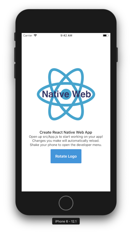
Install create-react-native-web-app
$ npm i -g create-react-native-web-app
Create gitphone project.
λ create-react-native-web-app gitphone

⏳ Creating React Native Web App by the name of gitphone ...

✅ Created project folder.

✅ Added project files.

⏳ Installing project dependencies...

yarn install v1.10.1
[1/4] Resolving packages...
[2/4] Fetching packages...
info fsevents@1.2.4: The platform "win32" is incompatible with this module.
info "fsevents@1.2.4" is an optional dependency and failed compatibility check. Excluding it from installation.
[3/4] Linking dependencies...
[4/4] Building fresh packages...
success Saved lockfile.
Done in 797.66s.

✅ Installed project dependencies.

✅ Done! 😁👍 Your project is ready for development.

* change directory to your new project
$ cd gitphone

$ Then run the these commands to get started:

* To run development Web server
$ yarn web

* To run Android on connected device (after installing Android Debug Bridge "adb" - https://developer.android.com/studio/releases/platform-tools)
$ yarn android

* To run ios simulator (after installing Xcode - only on Apple devices)
$ yarn ios

* To run tests for Native and Web
$ yarn test

* To run build for Web
$ yarn build
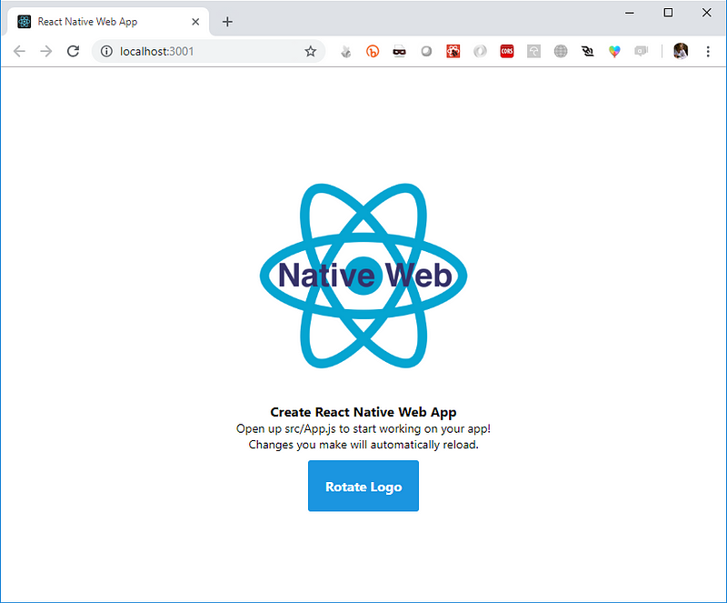
Change to gitphone directory and test the web app by running yarn web.
Starting the development server...
Compiled successfully!
You can now view create-react-native-web-app in the browser.
Local:            http://localhost:3001/
On Your Network:  http://172.26.235.145:3001/
Note that the development build is not optimized.
To create a production build, use yarn build.
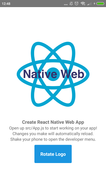
Now, test the gitphone android app by running yarn android.
Installing APK 'app-debug.apk' on 'Redmi 4X - 7.1.2' for app:debug
Installed on 1 device.

BUILD SUCCESSFUL

Total time: 21.783 secs

Starting: Intent { cmp=com.creaternwapp/.MainActivity }
✨  Done in 25.64s.
If the build successful, you'll see the app installed on your Android (emulator) device.
But if you got an error when run yarn android, please see Troubleshooting section below.
The last part for First Step, make sure it can be run on iOS without any problem. Run yarn ios and voila!
Installing React Native Elements (RNE).
$ yarn add react-native-elements@beta
Installing React Native Vector Icons (RNVI).
$ yarn add react-native-vector-icons
Linking:
$ react-native link react-native-vector-icons
Both RNE and RNVI are written using es6. If you run yarn web at this point, you'll got an error.
./node_modules/react-native-elements/src/config/withTheme.js
Module parse failed: Unexpected token (12:28)
You may need an appropriate loader to handle this file type.
We need to tell webpack to transpile them.
config/webpack.config.dev.jsProcess JS with babel, add RNE and RNVI to includeconfig/webpack.config.prod.js as well 👌If you get lost, see this gist or commit 8c0e603.
Now, let's grasp the idea how RNE works.
Open src/App.js
Import Button from RNE
import { Button } from 'react-native-elements';
On render, change TouchableHighlight to use RNE's Button
Run yarn ios, yarn android and yarn web to see it in action! 👏
Note: If you got an error Could not find com.android.tools.build.appt2 when running yarn android, add google on the gradle repositories.
See this gist or commit for the details: a2ebba1.
Our first component will be Home. On this component, there are two input fields and one Submit button.
src, create new folder: ComponentsHome.js gistApp.js, import Home component gistyarn ios, yarn android and yarn web to see it in action! 🎇You should notice that our Home doesn’t look good in term of UI. Let’s add styling for it.
Components, create Shared.style.js file gistHome component as below gistWait a minute… *Seems there is a problem with RNVI on the web version. You can check this Web (with webpack) article or just following steps bellow.
config/webpack.config.dev.jsconfig/webpack.config.prod.js as well 👌src/index.js fileiconFont and append style to document’s head gist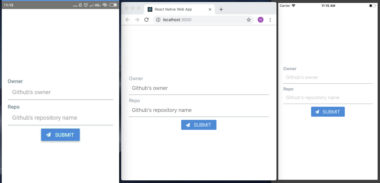 Our RNE x RNW progress so far~
Next, let’s add second component: CommitList.
Components named CommitCommitList.js gistOn our app, user goes to second screen by click on Submit button. How do we implement it?
“react-router comes to the rescue” - https://reacttraining.com/react-router/
Add react-router-dom and react-router-native
$ yarn add react-router-dom react-router-native
Web needs BrowserRouter while native NativeRouter. We need to separate it based on the platform.
src, create Utils folderUtils: Routing.native.js and Routing.web.js gistThose file’s content differ only on the second line. gist
Now, glue it together.
Open App.js, import CommitList component
Import Route, Router and Switch from Utils/Routing
Implement routing inside render method gist
Now for the action on Submit button, open Home.js
Import withRouter from Utils/Routing
import { withRouter } from '../Utils/Routing';
WithRouter is an HOC. Use it to wrap Home component
export default withRouter(Home);
Add onPress property for the button
onPress={this.onPressButton}
Implement the onPressButton event handler
onPressButton = () => this.props.history.push('/commit');
Test it on web and android, you should be able to go back and forth between screens using Submit and pressing Back button.
“How can I go back on iOS?” 😂
We will create a withHeader HOC. Why HOC? We can reuse it easier if we add more screens later.
On src, create HOCs folder
Add withHeader.js file
Import Header from RNE and Icon from RNVI/FontAwesome
import { Header } from 'react-native-elements';
import Icon from 'react-native-vector-icons/FontAwesome';
withHeader accepts one prop: title
const withHeader = ({ title = '' }) => (WrappedComponent) => {
Event handler to go back / go home
goBack = () => this.props.history.goBack();

goHome = () => this.props.history.replace('/');
Import and use withHeader in CommitList component gist | commit
Let’s fetch a real-live data: list commit on repository by GitHub and render it on our second screen, CommitList.
GET /repos/:owner/:repo/commits
Ideally, the :owner and :repo are form values from our first screen. Since the objective of this article is RNE x RNW, talk about that form (and state-management) later on.
To fetch GitHub API, we will use fetch-hoc package and also need compose from redux, to handle multiple HOCs on the same component.
$ yarn add fetch-hoc redux
Open CommitList.js
Import { compose } from redux and fetch from fetch-hoc
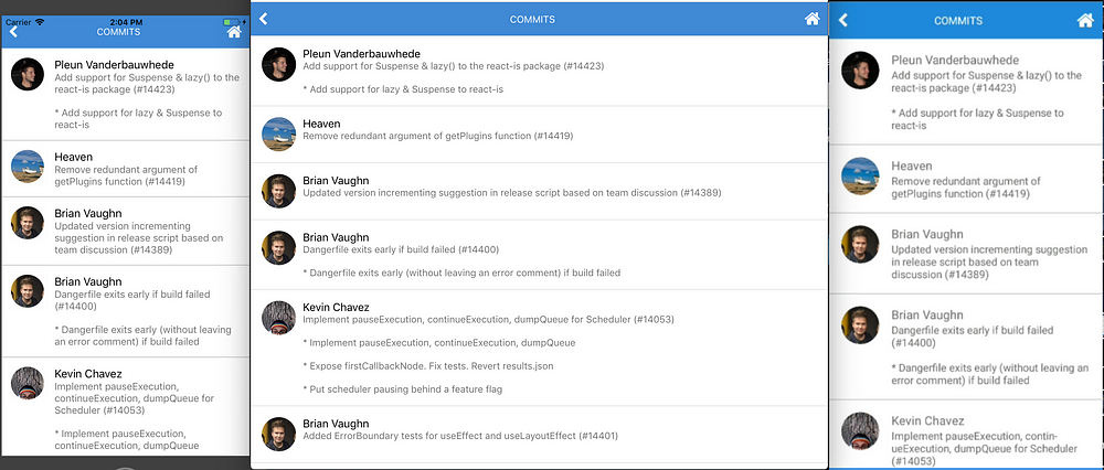
Now run yarn web, open network tab of DevTools and click Submit button, you’ll see bunch of commit data. By default GitHub API returning 30 commits.
Commit data that will be displayed on the screen:
author.avatar_url

commit:
  author.name
  message
Let’s modify CommitList.js
Add new imports
import { ActivityIndicator, Dimensions, FlatList, Platform, View } from 'react-native';
import { Avatar, ListItem } from 'react-native-elements';
On main render, modify it as below
<View style={styles.container}>
  {this.renderContent()}
</View>
Create renderContent method
renderContent = () => (
  this.props.loading ?
    <ActivityIndicator color='#87ceeb' /> :
    <FlatList
      keyExtractor={this.keyExtractor}
      data={this.props.data}
      renderItem={this.renderItem}
    />
)
Create renderItem method
renderItem = ({ item }) => (
  <ListItem
    title={item.commit.author.name}
    subtitle={item.commit.message}
    leftElement={this.renderLeftElement(item)
  />
)
Create renderLeftElement method
renderLeftElement = (item) => (
  <View>
    <Avatar
      source={{ uri: item.author.avatar_url }}
      size='medium'
      rounded
    />
  </View>
)
Here is our new CommitList including the styling to make it prettier gist | commit
Here they are!
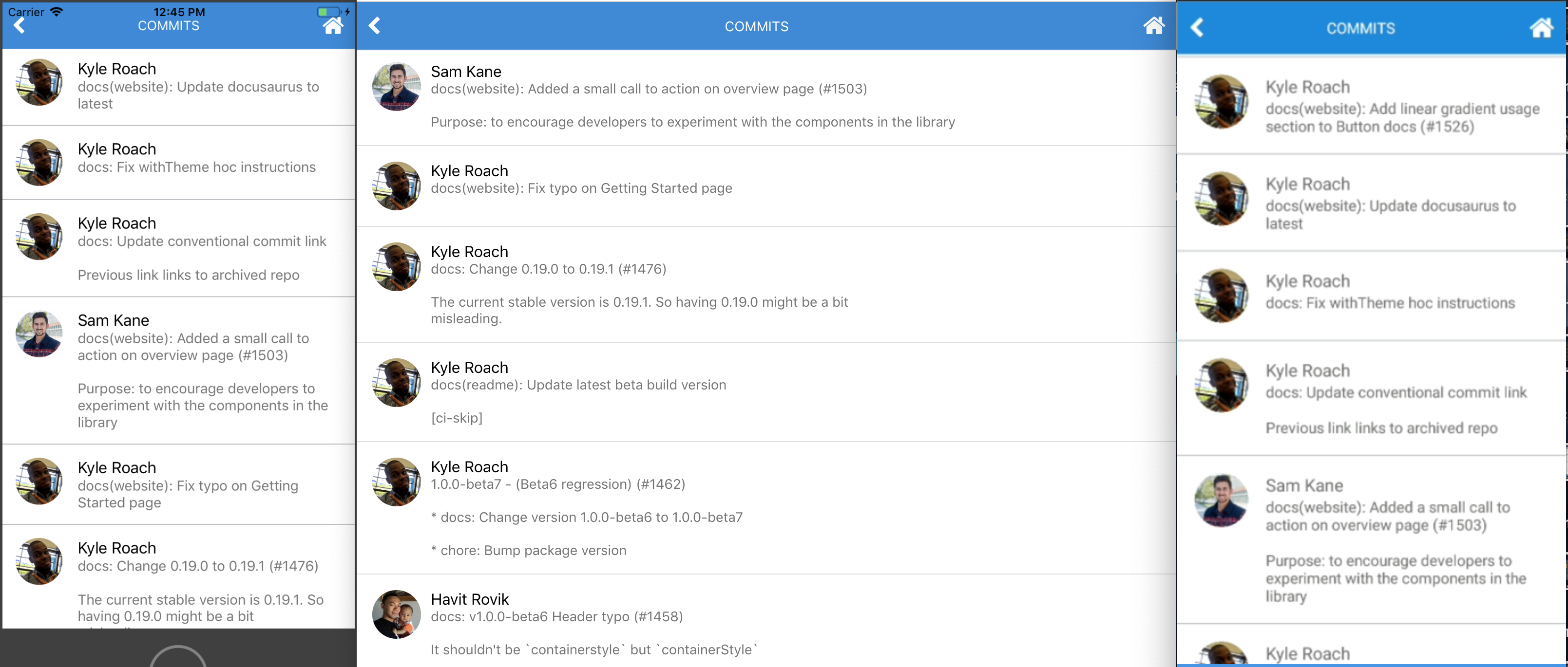 awesome, eh?
Our app looks great so far. But we are not passing values from first to second screen. Let’s do it.
To handle form, we’ll use formik
$ yarn add formik
Open Home.js and import it
import { Formik } from 'formik';
Wrap main View with formik
<Formik initialValues={{ owner: '', repo: '' }}
  onSubmit={this.onPressButton}>
  {({ handleChange, handleSubmit, values }) => (
    <View style={styles.container}>
Add onChangeText handler to the Input
<Input ... onChangeText={handleChange('owner')} value={values.owner}
<Input ... onChangeText={handleChange('repo')} value={values.repo}
Change Button onPress props to handleSubmit
<Button ... onPress={handleSubmit}
Don’t forget to close the main View
    </View>
  )}
</Formik>
Form submission: done 👌 Next question: How do we pass these values to second screen? Send them when we redirect to second screen!
Inside onPressButton method, send an object instead of pathname only.
this.props.history.push({
  pathname: '/commit',
  state: { owner, repo }
});
Open CommitList, import withRouter
import { withRouter } from '../../Utils/Routing';
Add withRouter inside compose
Get the values passed down to withRouter and use it to fetch
withHeader({ title: 'Commits' }),
withRouter,
fetch(({ location: { state = {} } }) => (
 `https://api.github.com/repos/${state.owner}/${state.repo}/commits`
))
HOC’s order does matter. So, make sure it the same as snippet above. In case you lost, here is the commit: 1d83c5e.
Test the app. Now we should able to fetch any GitHub repository, with some caveats. 👀
What happens if we fetch repository which doesn’t exist? Red screen on native, blank screen on web! 😹
fetch-hoc returns an error if it has. Let’s use it.
On CommitList, modify renderContent
this.props.loading ?
  <ActivityIndicator color='#87ceeb' /> :
  this.renderFlatList()
Import Text from RNE
import { ..., Text } from 'react-native-elements';
Add renderFlatList method
this.props.error ?
  <Text h4>Error: {this.props.data.message || '😕'}</Text> :
  <FlatList ... />
Test it. Instead of red or blank screen, now Error: Not Found displayed.
What’s else? Try to fetch facebook/react-native. We got another error 🙀
Cannot read property 'avatar_url' of null
Not all of author have avatar_url. We should do this for the Avatar source.
source={{uri: (item.author && item.author.avatar_url) || undefined}}
So, our app renders nothing if it has no url? It doesn’t look good. Solution: render author initial name.
With the help of RegEx and Avatar title props, renderLeftElement should look like this now:
renderLeftElement = (item) => {
  const initials = item.commit.author.name.match(/\b\w/g) || [];

return (
    <View style={leftElementStyle}>
      <Avatar
        title={((initials.shift() || '') + (initials.pop() || ''))}
        ...
Commit for Polishing the app section: 943974b.
When I wrote this, fetch facebook/react-native returning following:
.](https://cdn-images-1.medium.com/max/3812/1*OYTvJP0RLLQemyT0ukb1Iw.png) Why no love for regex? Thanks to Sanoor.
Why no love for regex? Thanks to Sanoor.
We have created a simple app using RNE + RNW 👏
Works great on iOS, web and android? ✅
Use components from react-native-elements? ✅
Move between screens? ✅
API calls? ✅
Some improvements for gitphone:
If you go back from Commits screen, input form on Home screen are empty. If you want preserve previous values, this can be fixed easily by introducing redux to the app. References here: 48108dd.
Can we fetch more commits data once we reach the most bottom of the list? Infinite scroll?
For web, we can use react-visibility-sensor. Check it out: 6c1f689.
For native, it’s easier. We can use FlatList onEndReached props. To give you an idea how, see this: 9d2e1f2.
#1 Build failed when running yarn android
:app:compileDebugAidl FAILED

FAILURE: Build failed with an exception.

* What went wrong:
Execution failed for task ':app:compileDebugAidl'.
> java.lang.IllegalStateException: aidl is missing

* Try:
Run with --stacktrace option to get the stack trace. Run with --info or --debug option to get more log output.

BUILD FAILED
Here is how to fix #1:
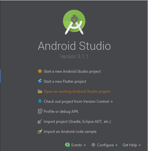
android project under gitphone.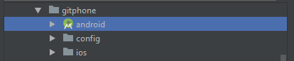
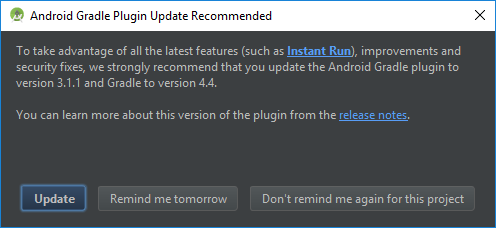
Wait for Android Studio syncing the project.
At this stage, just click Update Build Tools version and sync project on the sync window.
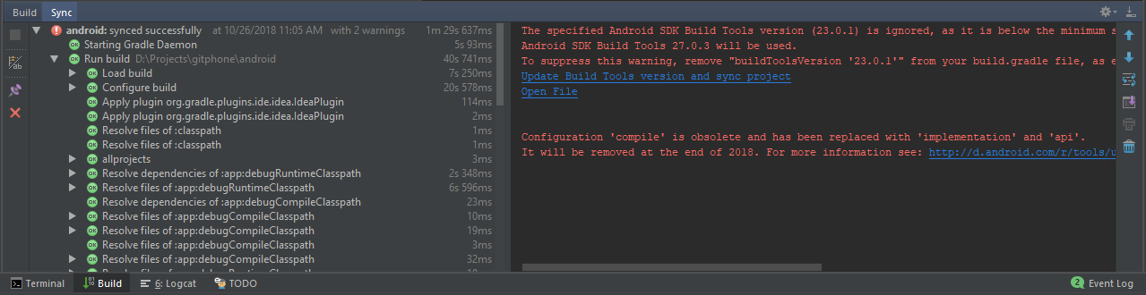
Now, the remaining warning is the Configuration 'compile'...
To fix that, open app/build.gradle file, change dependencies section (line 139) to use implementation instead of compile.
dependencies { implementation fileTree(dir: "libs", include: ["*.jar"]) implementation "com.android.support:appcompat-v7:23.0.1" implementation "com.facebook.react:react-native:+" }
Sync it again and close Android Studio.

Troubleshooting for android is done. Now, you should be able to run yarn android successfully.
#2 Build failed when running yarn ios
** BUILD FAILED **

The following build commands failed:

 CompileC /gitphone/ios/build/Build/Intermediates.noindex/React.build/Debug-iphonesimulator/double-conversion.build/Objects-normal/x86_64/strtod.o /gitphone/node_modules/react-native/third-party/double-conversion-1.1.5/src/strtod.cc normal x86_64 c++ com.apple.compilers.llvm.clang.1_0.compiler
Here is how to fix #2:
Inside the project, run script below from your favourite terminal
$ curl -L https://gist.githubusercontent.com/fiznool/739b8e592596b5731512edfd77a1a2e9/raw/e0123e0b2382e127f1cfd6e28228315f1299738f/fix-rn-xcode10.sh | bash
If you run yarn ios again, and you got this error
The following build commands failed:
 Libtool /gitphone/ios/build/Build/Products/Debug-iphonesimulator/libRCTWebSocket.a normal x86_64
(1 failure)
Please run this script:
$ cp ios/build/Build/Products/Debug-iphonesimulator/libfishhook.a node_modules/react-native/Libraries/WebSocket
Troubleshooting for iOS is done. Now, you should be able to run yarn ios successfully.