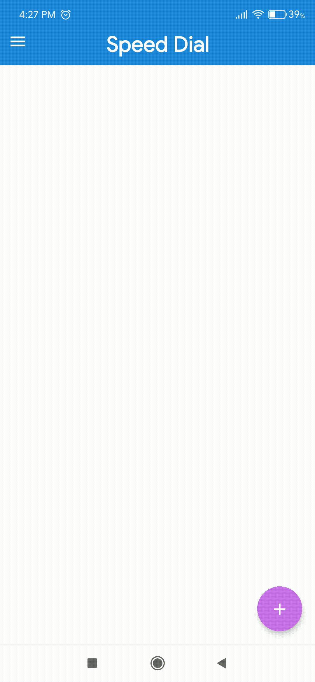
Speed Dial
When pressed, a floating action button can display three to six related actions in the form of a speed dial. If more than six actions are needed, something other than a FAB should be used to present them. Upon press, the FAB remains visible and emits a stack of related actions. If the FAB is tapped in this state, it should either initiate its default action or close the speed dial actions.
Usage
import { SpeedDial } from 'react-native-elements';
<SpeedDial
  isOpen={open}
  icon={{ name: 'edit', color: '#fff' }}
  openIcon={{ name: 'close', color: '#fff' }}
  onOpen={() => setOpen(!open)}
  onClose={() => setOpen(!open)}
>
  <SpeedDial.Action
    icon={{ name: 'add', color: '#fff' }}
    title="Add"
    onPress={() => console.log('Add Something')}
  />
  <SpeedDial.Action
    icon={{ name: 'delete', color: '#fff' }}
    title="Delete"
    onPress={() => console.log('Delete Something')}
  />
</SpeedDial>
Props
Also receives all FAB props except size
Reference
isOpen
Opens the action stack
| Type | Default |
|---|---|
boolean | false |
openIcon
Icon shown on FAB when action stack is open
| Type | Default |
|---|---|
IconNode | none |
transitionDuration
The duration for the transition, in milliseconds.
| Type | Default |
|---|---|
Number | 150 |
onOpen
Callback fired when the component requests to be open.
| Type | Default |
|---|---|
function | none |
onClose
Callback fired when the component requests to be closed.
| Type | Default |
|---|---|
function | none |
Child Components
SpeedDial.Action
Receives all FAB props.