Card
Cards are a great way to display information, usually containing content and actions about a single subject. Cards can contain images, buttons, text and more.
Usage
const users = [
{
name: 'brynn',
avatar: 'https://s3.amazonaws.com/uifaces/faces/twitter/brynn/128.jpg'
},
... // more users here
]
import { View, Text, Image } from 'react-native'
import { Card, ListItem, Button, Icon } from 'react-native-elements'
// implemented without image with header
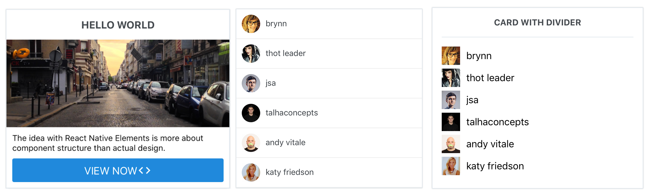
<Card>
<Card.Title>CARD WITH DIVIDER</Card.Title>
<Card.Divider/>
{
users.map((u, i) => {
return (
<View key={i} style={styles.user}>
<Image
style={styles.image}
resizeMode="cover"
source={{ uri: u.avatar }}
/>
<Text style={styles.name}>{u.name}</Text>
</View>
);
})
}
</Card>
// implemented without image without header, using ListItem component
<Card containerStyle={{padding: 0}} >
{
users.map((u, i) => <ListItem key={i} />)
}
</Card>
// implemented with Text and Button as children
<Card>
<Card.Title>HELLO WORLD</Card.Title>
<Card.Divider/>
<Card.Image source={require('../images/pic2.jpg')}>
<Text style={{marginBottom: 10}}>
The idea with React Native Elements is more about component structure than actual design.
</Text>
<Button
icon={<Icon name='code' color='#ffffff' />}
buttonStyle={{borderRadius: 0, marginLeft: 0, marginRight: 0, marginBottom: 0}}
title='VIEW NOW' />
</Card.Image>
</Card>
Props
Child Components
Card.Divider
Receives all Divider props.
Card.Title
Receives all Text props.
Card.Image
Receives all Image props.
Card.FeaturedTitle
Receives all Text props.
Card.FeaturedSubtitle
Receives all Text props.
Reference
containerStyle
outer container style (optional)
| Type | Default |
|---|---|
| object (style) | none |
wrapperStyle
inner container style (optional)
| Type | Default |
|---|---|
| object (style) | none |