Tooltip
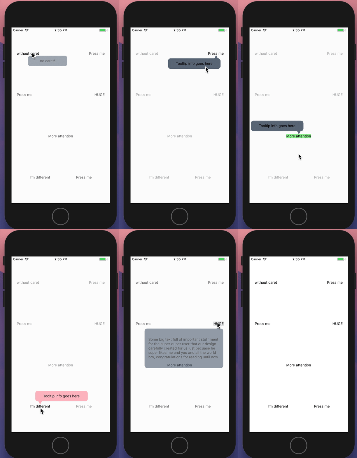
Tooltips display informative text when users tap on an element.
Usage
import { Tooltip, Text } from 'react-native-elements';

...

<Tooltip popover={<Text>Info here</Text>}>
  <Text>Press me</Text>
</Tooltip>
Web-platform specific note:
You must pass a valid React Native
Modalcomponent implementation intoModalComponentprop becauseModalcomponent is not implemented yet inreact-native-web
...
import Modal from 'modal-react-native-web';

...

<Tooltip ModalComponent={Modal} ... />
...
Props
backgroundColorcloseOnlyOnBackdropPresscontainerStyleheighthighlightColorModalComponentonCloseonOpenoverlayColorpointerColorpopoverskipAndroidStatusBartoggleActiontoggleOnPresswidthwithOverlaywithPointer
Reference
backgroundColor
sets backgroundColor of the tooltip and pointer.
| Type | Default |
|---|---|
| string | #617080 |
closeOnlyOnBackdropPress
Flag to determine whether to disable auto hiding of tooltip when touching/scrolling anywhere inside the active tooltip popover container.
- When
true, Tooltip closes only when overlay backdrop is pressed (or) highlighted tooltip button is pressed.
| Type | Default |
|---|---|
| boolean | false |
containerStyle
Passes style object to tooltip container
| Type | Default |
|---|---|
| object (style) | inherited styling |
height
Tooltip container height. Necessary in order to render the container in the correct place. Pass height according to the size of the content rendered inside the container.
| Type | Default |
|---|---|
| number | 40 |
highlightColor
Color to highlight the item the tooltip is surrounding.
| Type | Default |
|---|---|
| string | transparent |
ModalComponent
override React Native Modal component (usable for web-platform)
| Type | Default |
|---|---|
| React Native Component | Modal |
Interaction methods
| method | description |
|---|---|
| toggleTooltip | Toggles tooltip manually. (example) |
toggleTooltip example
Store a reference to the Tooltip in your component by using the ref prop provided by React (see docs):
const tooltipRef = useRef(null);

...

<Tooltip
  ref={tooltipRef}
  ...
/>
Then you can manually trigger tooltip from anywhere for example when screen loads:
useEffect(() => {
  tooltipRef.current.toggleTooltip();
}, []);
onClose
function which gets called on closing the tooltip.
| Type | Default |
|---|---|
| function | () => {} |
onOpen
function which gets called on opening the tooltip.
| Type | Default |
|---|---|
| function | () => {} |
overlayColor
Color of overlay shadow when tooltip is open.
| Type | Default |
|---|---|
| string | 'rgba(250, 250, 250, 0.70)' |
pointerColor
Color of tooltip pointer, it defaults to the
backgroundColor if none is passed .
| Type | Default |
|---|---|
| string | backgroundColor |
popover
Component to be rendered as the display container.
| Type | Default |
|---|---|
| React.Element | null |
skipAndroidStatusBar
Force skip StatusBar height when calculating element position. Pass true if Tooltip used inside react-native Modal component.
| Type | Default |
|---|---|
| boolean | false |
toggleAction
Define type of action that should trigger tooltip. Available options onPress, onLongPress
| Type | Default |
|---|---|
| string | onPress |
toggleOnPress
Flag to determine to toggle or not the tooltip on press.
| Type | Default |
|---|---|
| boolean | true |
width
Tooltip container width. Necessary in order to render the container in the correct place. Pass height according to the size of the content rendered inside the container.
| Type | Default |
|---|---|
| number | 150 |
withOverlay
Flag to determine whether or not display overlay shadow when tooltip is open.
| Type | Default |
|---|---|
| boolean | true |
withPointer
Flag to determine whether or not to display the pointer.
| Type | Default |
|---|---|
| boolean | true |