ListItem
ListItems are used to display rows of information, such as a contact list, playlist, or menu. They are very customizable and can contain switches, avatars, badges, icons, and more.
Usage
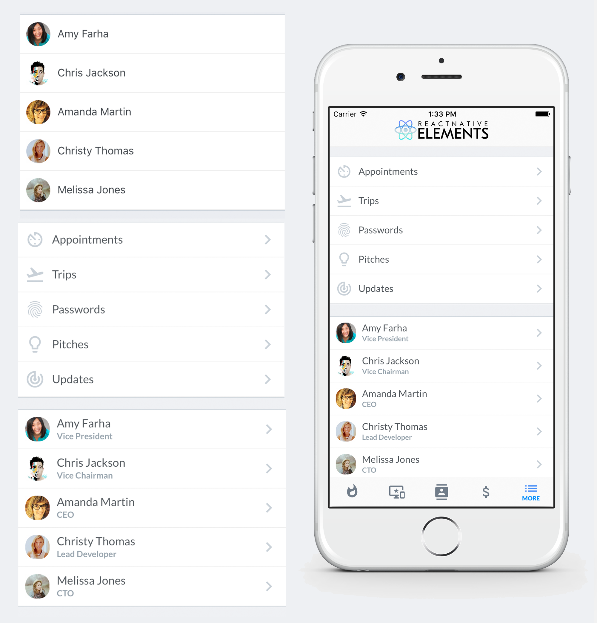
Using Map Function - Implemented with avatar
import { ListItem, Avatar } from 'react-native-elements'

const list = [
  {
    name: 'Amy Farha',
    avatar_url: 'https://s3.amazonaws.com/uifaces/faces/twitter/ladylexy/128.jpg',
    subtitle: 'Vice President'
  },
  {
    name: 'Chris Jackson',
    avatar_url: 'https://s3.amazonaws.com/uifaces/faces/twitter/adhamdannaway/128.jpg',
    subtitle: 'Vice Chairman'
  },
  ... // more items
]

<View>
  {
    list.map((l, i) => (
      <ListItem key={i} bottomDivider>
        <Avatar source={{uri: l.avatar_url}} />
        <ListItem.Content>
          <ListItem.Title>{l.name}</ListItem.Title>
          <ListItem.Subtitle>{l.subtitle}</ListItem.Subtitle>
        </ListItem.Content>
      </ListItem>
    ))
  }
</View>
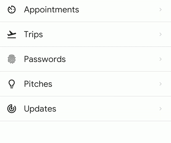
Using Map Function - Implemented with link and icon
import { ListItem, Icon } from 'react-native-elements'

const list = [
  {
    title: 'Appointments',
    icon: 'av-timer'
  },
  {
    title: 'Trips',
    icon: 'flight-takeoff'
  },
  ... // more items
]

<View>
  {
    list.map((item, i) => (
      <ListItem key={i} bottomDivider>
        <Icon name={item.icon} />
        <ListItem.Content>
          <ListItem.Title>{item.title}</ListItem.Title>
        </ListItem.Content>
        <ListItem.Chevron />
      </ListItem>
    ))
  }
</View>
Using RN FlatList - Implemented with link and avatar
import { ListItem, Avatar } from 'react-native-elements'

const list = [
  {
    name: 'Amy Farha',
    avatar_url: 'https://s3.amazonaws.com/uifaces/faces/twitter/ladylexy/128.jpg',
    subtitle: 'Vice President'
  },
  {
    name: 'Chris Jackson',
    avatar_url: 'https://s3.amazonaws.com/uifaces/faces/twitter/adhamdannaway/128.jpg',
    subtitle: 'Vice Chairman'
  },
  ... // more items
]

keyExtractor = (item, index) => index.toString()

renderItem = ({ item }) => (
  <ListItem bottomDivider>
    <Avatar source={{uri: item.avatar_url}} />
    <ListItem.Content>
      <ListItem.Title>{item.name}</ListItem.Title>
      <ListItem.Subtitle>{item.subtitle}</ListItem.Subtitle>
    </ListItem.Content>
    <ListItem.Chevron />
  </ListItem>
)

render () {
  return (
    <FlatList
      keyExtractor={this.keyExtractor}
      data={list}
      renderItem={this.renderItem}
    />
  )
}
Using RN FlatList - Implemented with custom avatar component.
import { ListItem, Avatar } from 'react-native-elements'

const list = [
  {
    name: 'Amy Farha',
    subtitle: 'Vice President'
  },
  {
    name: 'Chris Jackson',
    avatar_url: 'https://s3.amazonaws.com/uifaces/faces/twitter/adhamdannaway/128.jpg',
    subtitle: 'Vice Chairman'
  },
  ... // more items
]

keyExtractor = (item, index) => index.toString()

renderItem = ({ item }) => (
  <ListItem bottomDivider >
    <Avatar title={item.name[0]} source={item.avatar_url && { uri: item.avatar_url }}/>
    <ListItem.Content>
      <ListItem.Title>{item.name}</ListItem.Title>
      <ListItem.Subtitle>{item.subtitle}</ListItem.Subtitle>
    </ListItem.Content>
    <ListItem.Chevron />
  </ListItem>
)

render () {
  return (
    <FlatList
      keyExtractor={this.keyExtractor}
      data={list}
      renderItem={this.renderItem}
    />
  )
}
ListItem implemented with custom View for Subtitle
import { ListItem, Avatar } from 'react-native-elements'

render () {
  return (
    <ListItem>
      <Avatar source={require('../images/avatar1.jpg')} />
      <ListItem.Content>
        <ListItem.Title>Limited supply! Its like digital gold!</ListItem.Title>
        <View style={styles.subtitleView}>
          <Image source={require('../images/rating.png')} style={styles.ratingImage}/>
          <Text style={styles.ratingText}>5 months ago</Text>
        </View>
      </ListItem.Content>
    </ListItem>
  )
}

styles = StyleSheet.create({
  subtitleView: {
    flexDirection: 'row',
    paddingLeft: 10,
    paddingTop: 5
  },
  ratingImage: {
    height: 19.21,
    width: 100
  },
  ratingText: {
    paddingLeft: 10,
    color: 'grey'
  }
})
Badges

Example badge usage
<ListItem>
  <Badge
    value={3}
    textStyle={{ color: 'orange' }}
    containerStyle={{ marginTop: -20 }}
  />
</ListItem>
Linear gradient + Scale feedback

import { ListItem, Avatar } from 'react-native-elements';
import TouchableScale from 'react-native-touchable-scale'; // https://github.com/kohver/react-native-touchable-scale
import LinearGradient from 'react-native-linear-gradient'; // Only if no expo

<ListItem
  Component={TouchableScale}
  friction={90} //
  tension={100} // These props are passed to the parent component (here TouchableScale)
  activeScale={0.95} //
  linearGradientProps={{
    colors: ['#FF9800', '#F44336'],
    start: { x: 1, y: 0 },
    end: { x: 0.2, y: 0 },
  }}
  ViewComponent={LinearGradient} // Only if no expo
>
  <Avatar rounded source={{ uri: avatar_url }} />
  <ListItem.Content>
    <ListItem.Title style={{ color: 'white', fontWeight: 'bold' }}>
      Chris Jackson
    </ListItem.Title>
    <ListItem.Subtitle style={{ color: 'white' }}>
      Vice Chairman
    </ListItem.Subtitle>
  </ListItem.Content>
  <ListItem.Chevron color="white" />
</ListItem>;
ListItem Accordion
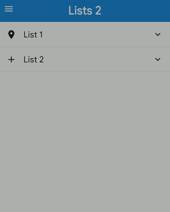
<ListItem.Accordion
  content={
    <>
      <Icon name="place" size={30} />
      <ListItem.Content>
        <ListItem.Title>List Accordion</ListItem.Title>
      </ListItem.Content>
    </>
  }
  isExpanded={expanded}
  onPress={() => {
    setExpanded(!expanded);
  }}
>
  {list2.map((l, i) => (
    <ListItem key={i} onPress={log} bottomDivider>
      <Avatar title={l.name[0]} source={{ uri: l.avatar_url }} />
      <ListItem.Content>
        <ListItem.Title>{l.name}</ListItem.Title>
        <ListItem.Subtitle>{l.subtitle}</ListItem.Subtitle>
      </ListItem.Content>
      <ListItem.Chevron />
    </ListItem>
  ))}
</ListItem.Accordion>
ListItem Swipeable
<ListItem.Swipeable
  leftContent={
    <Button
      title="Info"
      icon={{ name: 'info', color: 'white' }}
      buttonStyle={{ minHeight: '100%' }}
    />
  }
  rightContent={
    <Button
      title="Delete"
      icon={{ name: 'delete', color: 'white' }}
      buttonStyle={{ minHeight: '100%', backgroundColor: 'red' }}
    />
  }
>
  <Icon name="My Icon" />
  <ListItem.Content>
    <ListItem.Title>Hello Swiper</ListItem.Title>
  </ListItem.Content>
  <ListItem.Chevron />
</ListItem.Swipeable>
Props
Also receives all TouchableHighlight props
bottomDividerComponentcontainerStyledisableddisabledStyleonLongPressonPresspadtopDividerViewComponent
Child Components
ListItem.ButtonGroup
Receives all ButtonGroup props.
ListItem.CheckBox
Receives all CheckBox props.
ListItem.Chevron
Receives all Icon props.
ListItem.Content
Receives all View props.
ListItem.Input
Receives all Input props.
ListItem.Subtitle
Receives all Text props.
ListItem.Title
Receives all Text props.
ListItem.Accordion
Also Receives all ListItem props.
ListItem.Swipeable
Also recieves all
ListItemProps
Reference
bottomDivider
Add divider at the bottom of the list item
| Type | Default |
|---|---|
| boolean | false |
Component
replace element with custom element (optional)
| Type | Default |
|---|---|
| View or TouchableHighlight (default) if onPress method is added as prop | component |
containerStyle
additional main container styling (optional)
| Type | Default |
|---|---|
| object (style) | none |
disabled
If true the user won't be able to perform any action on the list item.
| Type | Default |
|---|---|
| boolean | none |
disabledStyle
Specific styling to be used when list item is disabled.
| Type | Default |
|---|---|
| object (style) | none |
onLongPress
onLongPress method for link (optional)
| Type | Default |
|---|---|
| function | none |
onPress
onPress method for link (optional)
| Type | Default |
|---|---|
| function | none |
pad
adds spacing between the leftComponent, the title component & right component
| Type | Default |
|---|---|
| number | 16 |
topDivider
Add divider at the top of the list item
| Type | Default |
|---|---|
| boolean | false |
ViewComponent
Container for linear gradient (for non-expo user)
| Type | Default |
|---|---|
| component | View |
isExpanded
Accordion Expanded
| Type | Default |
|---|---|
| booleon | false |
icon
Icon for unexpanded Accordion
| Type | Default |
|---|---|
| IocnNode | chevron-down |
expandIcon
Icon when Accordion is expanded, if not provided icon will be rotated 180deg (optional)
| Type | Default |
|---|---|
| IconNode | none |
content
Similar to ListItem's child
| Type | Default |
|---|---|
| ReactNode | Empty ListItem.Content |
noIcon
Don't show accordion icon
| Type | Default |
|---|---|
| boolean | false |
noRotation
Don't rotate when Accordion is expanded
| Type | Default |
|---|---|
| boolean | false |
animation
Boolean to show animation,
| Type | Default |
|---|---|
| Object or number | {type:"timing",duration:350} |
leftContent
Left Content
| Type | Default |
|---|---|
| ReactNode | none |
rightContent
Right Content
| Type | Default |
|---|---|
| ReactNode | none |
leftStyle
Style of left container
| Type | Default |
|---|---|
| object (style) | none |
rightStyle
Style of right container
| Type | Default |
|---|---|
| object (style) | none |
leftWidth
Width to swipe left
| Type | Default |
|---|---|
| number | ScreenWidth/3 |
rightWidth
Width to swipe right
| Type | Default |
|---|---|
| number | ScreenWidth/3 |