Badge
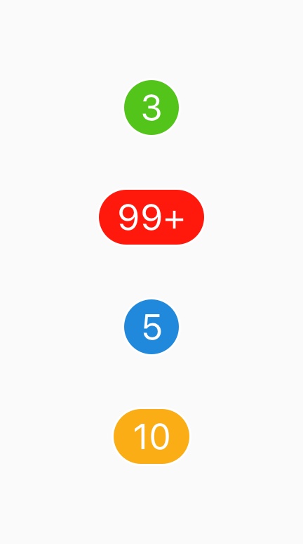
Badges are small components typically used to communicate a numerical value or indicate the status of an item to the user.

Mini Badge
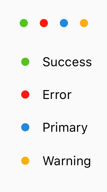
This type of badge shows when no value prop is provided. This form is
effective for showing statuses.
withBadge Higher-Order Component
The withBadge HOC allows you to easily add badges to icons and other components.
Usage
import { Text, View } from 'react-native'
import { Avatar, Badge, Icon, withBadge } from 'react-native-elements'

// Standard badge
<Badge value="99+" status="error" />
<Badge value={<Text>My Custom Badge</Text>} />

// Mini badge
<Badge status="success" />
<Badge status="error" />
<Badge status="primary" />
<Badge status="warning" />

// Avatar with mini badge
<View>
  <Avatar
    rounded
    source={{
      uri: 'https://randomuser.me/api/portraits/men/41.jpg',
    }}
    size="large"
  />

  <Badge
    status="success"
    containerStyle={{ position: 'absolute', top: -4, right: -4 }}
  />
</View>

// withBadge HOC

const BadgedIcon = withBadge(1)(Icon)
<BadgedIcon type="ionicon" name="ios-chatbubbles" />

// Using the decorator proposal
@connect(state => ({
  notifications: state.notifications,
}))
@withBadge(props => props.notifications.length)
export default class MyDecoratedIcon extends React.Component {
  render() {
    return (
      <Icon type="ionicon" name="md-cart" />
    );
  }
}
Props
Reference
badgeStyle
Additional styling for badge (background) view component (optional)
| Type | Default |
|---|---|
| View style (object) | Internal Style |
Component
Custom component to replace the badge outer component
| Type | Default |
|---|---|
| React Native Component | View, if onPress then TouchableOpacity |
containerStyle
Style for the container (optional)
| Type | Default |
|---|---|
| View style (object) | Internal Style |
onPress
Function called when pressed on the badge
| Type | Default |
|---|---|
| function | none |
status
Determines color of the indicator
| Type | Default |
|---|---|
primary, success, warning, error | primary |
textProps
Extra props for text component (optional)
| Type | Default |
|---|---|
| Text props (object) | none |
textStyle
Extra styling for icon component (optional)
| Type | Default |
|---|---|
| Text style (object) | Internal Style |
value
Text value to be displayed by badge, defaults to empty
| Type | Default |
|---|---|
| String OR Number OR React Native Component | none |
Props for withBadge
Reference for withBadge
options
Also receives all Badge props.
Object with the following (optional) keys:
bottom
| Type | Default |
|---|---|
| number (optional) | undefined |
left
| Type | Default |
|---|---|
| number (optional) | undefined |
right
| Type | Default |
|---|---|
| number (optional) | -16 (-3 with MiniBadge aka. without value) |
top
| Type | Default |
|---|---|
| number (optional) | -1 (3 with MiniBadge) |
hidden
| Type | Default |
|---|---|
| boolean (optional) | false |
containerStyle
| Type | Default |
|---|---|
| View style (object) | Internal Style |
value
Text value to be displayed by badge, defaults to empty
| Type | Default |
|---|---|
| String OR Number OR React Native Component OR Function, which returns one of the former | none |