Chip
Chips are compact elements that represent an input, attribute, or action. They may display text, icons, or both.
Usage
import { Chip } from 'react-native-elements';
import Icon from 'react-native-vector-icons/FontAwesome';
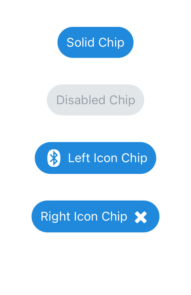
<Chip
title="Solid Chip"
/>
<Chip
title="Disabled Chip"
disabled
/>
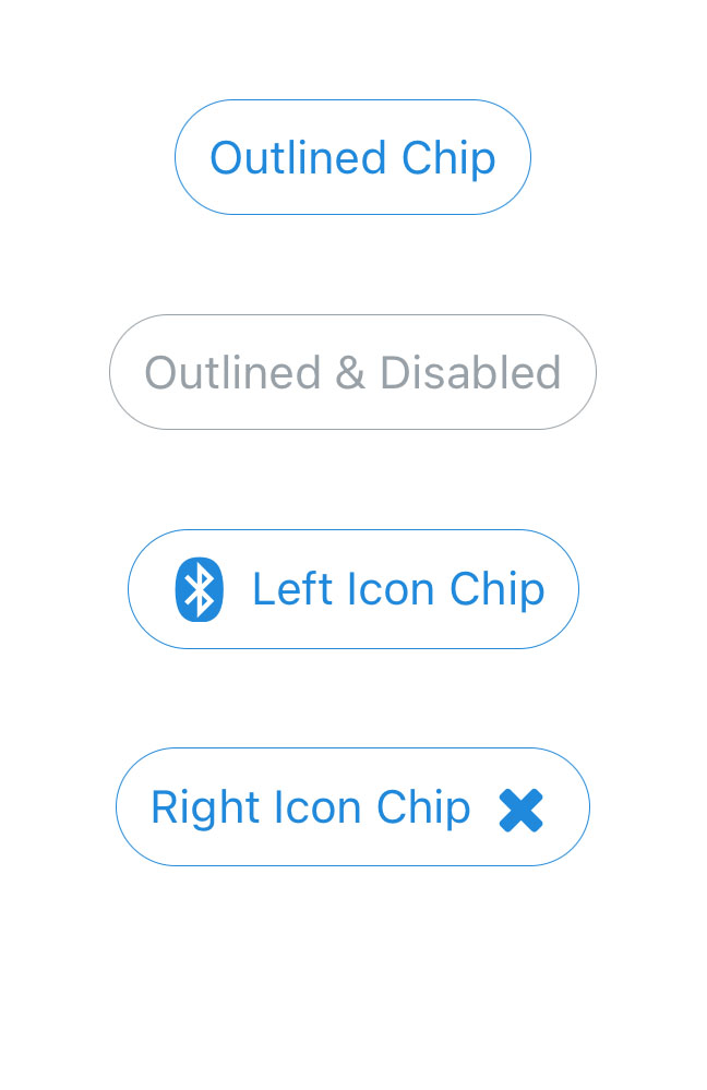
<Chip
title="Outlined Chip"
type="outline"
/>
<Chip
title="Outlined & Disabled"
type="outline"
disabled
/>
<Chip
title="Left Icon Chip"
icon={{
name: "bluetooth",
type: "font-awesome",
size: 20,
color: 'white',
}}
/>
<Chip
title="Right Icon Chip"
icon={{
name: "close",
type: "font-awesome",
size: 20,
color: "white",
}}
iconRight
/>
Props
This component receives all TouchableNativeFeedback (Android) or TouchableOpacity (iOS) props, along with Button props
Reference
type
Type of button (optional)
| Type | Default |
|---|---|
solid, outline | solid |
LinearGradient Usage
Using LinearGradient in React Native Elements is supported through the
react-native-linear-gradient
package. If you're using expo or create-react-native-app then you can use
linearGradientProps prop right out the box with no additional setup.
For react-native-cli users, make sure to follow the installation instructions and use it like this:
import { Chip } from 'react-native-elements';
import LinearGradient from 'react-native-linear-gradient';

...

<Chip
  ViewComponent={LinearGradient} // Don't forget this!
  linearGradientProps={{
    colors: ['red', 'pink'],
    start: { x: 0, y: 0.5 },
    end: { x: 1, y: 0.5 },
  }}
/>