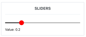
Slider
Sliders allow users to select a value from a fixed set of options.
This component is a forked implementation of react-native-slider.
Usage
import { Slider } from 'react-native-elements';
import { Animated } from 'react-native';

<View style={{ flex: 1, alignItems: 'stretch', justifyContent: 'center' }}>
  <Slider
    value={this.state.value}
    onValueChange={(value) => this.setState({ value })}
  />
  <Text>Value: {this.state.value}</Text>
</View>;

// Replace Thumb with custom image
<View style={{ flex: 1, alignItems: 'stretch', justifyContent: 'center' }}>
  <Slider
    value={this.state.value}
    onValueChange={(value) => this.setState({ value })}
    thumbStyle={{ height: 40, width: 40, backgroundColor: 'transparent' }}
    thumbProps={{
      Component: Animated.Image,
      source: {
        uri: 'https://s3.amazonaws.com/uifaces/faces/twitter/ladylexy/128.jpg',
      },
    }}
  />
  <Text>Value: {this.state.value}</Text>
</View>;

// Set Custom Children inside thumb
<View style={{ flex: 1, alignItems: 'stretch', justifyContent: 'center' }}>
  <Slider
    value={value}
    onValueChange={setValue}
    maximumValue={50}
    minimumValue={20}
    step={1}
    trackStyle={{ height: 10, backgroundColor: 'transparent' }}
    thumbStyle={{ height: 20, width: 20, backgroundColor: 'transparent' }}
    thumbProps={{
      children: (
        <Icon
          name="heartbeat"
          type="font-awesome"
          size={20}
          reverse
          containerStyle={{ bottom: 20, right: 20 }}
          color="#f50"
        />
      ),
    }}
  />
  <Text>Value: {this.state.value}</Text>
</View>;
Props
animateTransitionsanimationConfiganimationTypedebugTouchAreadisabledmaximumTrackTintColormaximumValueminimumTrackTintColorminimumValueallowTouchTrackonSlidingCompleteonSlidingStartonValueChangeorientationstepstylethumbStylethumbPropsthumbTintColorthumbTouchSizetrackStylevalue
Reference
animateTransitions
Set to true if you want to use the default 'spring' animation
| Type | Default | Optional |
|---|---|---|
| bool | false | Yes |
animationConfig
Used to configure the animation parameters. These are the same parameters in the Animated library.
| Type | Default | Optional |
|---|---|---|
| object | undefined | Yes |
animationType
Set to 'spring' or 'timing' to use one of those two types of animations with the default animation properties.
| Type | Default | Optional |
|---|---|---|
| string | 'timing' | Yes |
debugTouchArea
Set this to true to visually see the thumb touch rect in green.
| Type | Default | Optional |
|---|---|---|
| bool | false | Yes |
disabled
If true the user won't be able to move the slider
| Type | Default | Optional |
|---|---|---|
| bool | false | Yes |
maximumTrackTintColor
The color used for the track to the right of the button
| Type | Default | Optional |
|---|---|---|
| string | '#b3b3b3' | Yes |
maximumValue
Initial maximum value of the slider
| Type | Default | Optional |
|---|---|---|
| number | 1 | Yes |
minimumTrackTintColor
The color used for the track to the left of the button
| Type | Default | Optional |
|---|---|---|
| string | '#3f3f3f' | Yes |
minimumValue
Initial minimum value of the slider
| Type | Default | Optional |
|---|---|---|
| number | 0 | Yes |
allowTouchTrack
If true, thumb will respond and jump to any touch along the track.
| Type | Default | Optional |
|---|---|---|
| boolean | false | Yes |
onSlidingComplete
Callback called when the user finishes changing the value (e.g. when the slider is released)
| Type | Default | Optional |
|---|---|---|
| function | Yes |
onSlidingStart
Callback called when the user starts changing the value (e.g. when the slider is pressed)
| Type | Default | Optional |
|---|---|---|
| function | Yes |
onValueChange
Callback continuously called while the user is dragging the slider
| Type | Default | Optional |
|---|---|---|
| function | Yes |
orientation
Set the orientation of the slider.
| Type | Default | Optional |
|---|---|---|
| string | 'horizontal' | Yes |
step
Step value of the slider. The value should be between 0 and maximumValue - minimumValue)
| Type | Default | Optional |
|---|---|---|
| number | 0 | Yes |
style
The style applied to the slider container
| Type | Default | Optional |
|---|---|---|
| style | Yes |
thumbStyle
The style applied to the thumb
| Type | Default | Optional |
|---|---|---|
| style | Yes |
thumbProps
The props applied to the thumb. Uses Component prop which can accept Animated components.
| Type | Default | Optional |
|---|---|---|
| object | Yes |
thumbTintColor
The color used for the thumb
| Type | Default | Optional |
|---|---|---|
| string | '#343434' | Yes |
thumbTouchSize
The size of the touch area that allows moving the thumb. The touch area has the same center as the visible thumb. This allows to have a visually small thumb while still allowing the user to move it easily.
| Type | Default | Optional |
|---|---|---|
| object | {width: 40, height: 40} | Yes |
trackStyle
The style applied to the track
| Type | Default | Optional |
|---|---|---|
| style | Yes |
value
Initial value of the slider
| Type | Default | Optional |
|---|---|---|
| number | 0 | Yes |