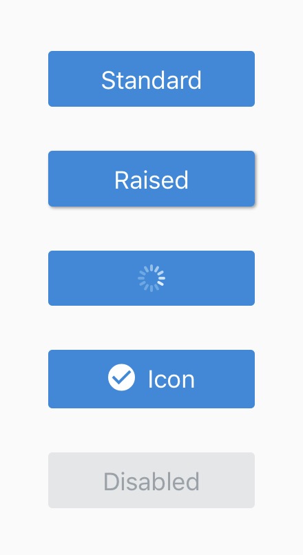
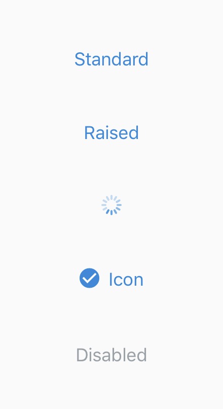
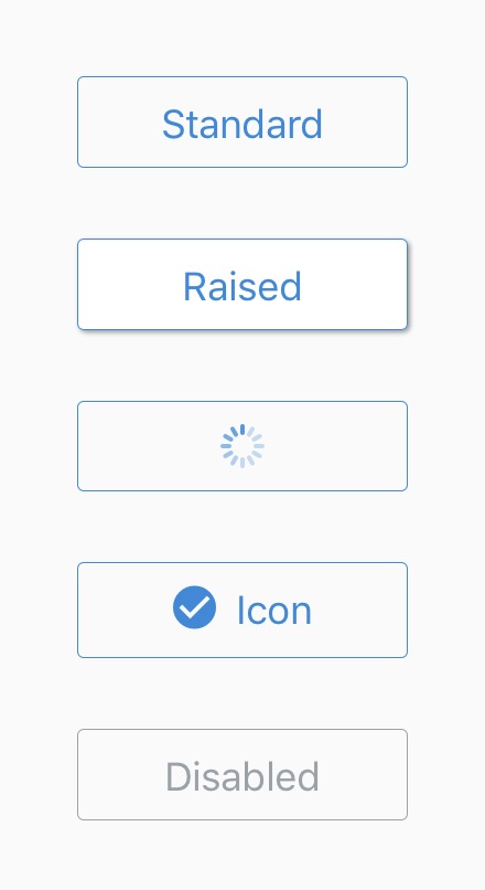
Button
Buttons are touchable elements used to interact with the screen. They may display text, icons, or both. Buttons can be styled with several props to look a specific way.
Usage
import { Button } from 'react-native-elements';
import Icon from 'react-native-vector-icons/FontAwesome';

<Button
  title="Solid Button"
/>

<Button
  title="Outline button"
  type="outline"
/>

<Button
  title="Clear button"
  type="clear"
/>

<Button
  icon={
    <Icon
      name="arrow-right"
      size={15}
      color="white"
    />
  }
  title="Button with icon component"
/>

<Button
  icon={{
    name: "arrow-right",
    size: 15,
    color: "white"
  }}
  title="Button with icon object"
/>

<Button
  icon={
    <Icon
      name="arrow-right"
      size={15}
      color="white"
    />
  }
  iconRight
  title="Button with right icon"
/>

<Button
  title="Loading button"
  loading
/>
Props
Also receives all TouchableNativeFeedback (Android) or TouchableOpacity (iOS) props
buttonStylecontainerStyledisableddisabledStyledisabledTitleStyleiconiconContainerStyleiconRightlinearGradientPropsloadingloadingPropsloadingStyleonPressraisedtitletitlePropstitleStyletypeTouchableComponentViewComponent
Reference
buttonStyle
add additional styling for button component (optional)
| Type | Default |
|---|---|
| View style (object) | none |
containerStyle
styling for Component container
| Type | Default |
|---|---|
| View style (object) | none |
disabled
disables user interaction
| Type | Default |
|---|---|
| boolean | false |
disabledStyle
style of the button when disabled
| Type | Default |
|---|---|
| View style (object) | Internal Style |
disabledTitleStyle
style of the title when disabled
| Type | Default |
|---|---|
| Text style (object) | Internal Style |
icon
displays a centered icon (when no title) or to the left (with text). (can be used along with iconRight as well). Can be an object or a custom component.
| Type | Default |
|---|---|
| {...Icon props} OR component | none |
iconContainerStyle
styling for Icon Component container
| Type | Default |
|---|---|
| View style (object) | none |
iconRight
displays Icon to the right of title. Needs to be used along with icon prop
| Type | Default |
|---|---|
| boolean | false |
linearGradientProps
displays a linear gradient. See usage.
| Type | Default |
|---|---|
| {...Gradient props} | none |
loading
prop to display a loading spinner (optional)
| Type | Default |
|---|---|
| boolean | false |
loadingProps
add additional props for ActivityIndicator component (optional)
| Type | Default |
|---|---|
| {...ActivityIndicator props} | Internal object |
loadingStyle
add additional styling for loading component (optional)
| Type | Default |
|---|---|
| View style (object) | Internal Style |
onPress
onPress method (optional)
| Type | Default |
|---|---|
| function | none |
raised
Add raised button styling (optional). Has no effect if type="clear".
| Type | Default |
|---|---|
| boolean | false |
title
button title (optional)
| Type | Default |
|---|---|
| string | none |
titleProps
add additional props for Text component (optional)
| Type | Default |
|---|---|
| {...Text props} | none |
titleStyle
add additional styling for title component (optional)
| Type | Default |
|---|---|
| Text style (object) | none |
type
Type of button (optional)
| Type | Default |
|---|---|
solid, clear, outline | solid |
TouchableComponent
component for user interaction
| Type | Default |
|---|---|
| Touchable Component | TouchableOpacity (ios) or TouchableNativeFeedback (android) |
ViewComponent
component for container
| Type | Default |
|---|---|
| React Native Component | View |
LinearGradient Usage
Using LinearGradient in React Native Elements is supported through the
react-native-linear-gradient
package. If you're using expo or create-react-native-app then you can use
linearGradientProps prop right out the box with no additional setup.
For react-native-cli users, make sure to follow the installation instructions and use it like this:
import { Button } from 'react-native-elements';
import LinearGradient from 'react-native-linear-gradient';

...

<Button
  ViewComponent={LinearGradient} // Don't forget this!
  linearGradientProps={{
    colors: ['red', 'pink'],
    start: { x: 0, y: 0.5 },
    end: { x: 1, y: 0.5 },
  }}
/>