CheckBox
CheckBoxes allow users to complete tasks that involve making choices such as selecting options, or switching settings on or off. It provides a clear visual of either a true or false choice.
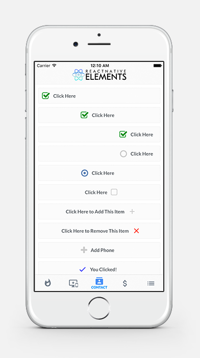
Usage
import { CheckBox } from 'react-native-elements'

<CheckBox
  title='Click Here'
  checked={this.state.checked}
/>

<CheckBox
  center
  title='Click Here'
  checked={this.state.checked}
/>

<CheckBox
  center
  title='Click Here'
  checkedIcon='dot-circle-o'
  uncheckedIcon='circle-o'
  checked={this.state.checked}
/>

<CheckBox
  center
  title='Click Here to Remove This Item'
  iconRight
  iconType='material'
  checkedIcon='clear'
  uncheckedIcon='add'
  checkedColor='red'
  checked={this.state.checked}
/>

<CheckBox
  checkedIcon={<Image source={require('../checked.png')} />}
  uncheckedIcon={<Image source={require('../unchecked.png')} />}
  checked={this.state.checked}
  onPress={() => this.setState({checked: !this.state.checked})}
/>
Props
iconTypeComponentcheckedsizeiconRightrightcentertitletitlePropscontainerStyletextStyleonLongPressonLongIconPressonPressonIconPresscheckedIconuncheckedIconcheckedColoruncheckedColorcheckedTitlefontFamily
Reference
iconType
type of icon set. Supported sets here.
| Type | Default |
|---|---|
| string | font-awesome |
Component
Specify React Native component for main button (optional)
| Type | Default |
|---|---|
| React Native Component | TouchableOpacity |
checked
Flag for checking the icon (required)
| Type | Default |
|---|---|
| boolean | false |
size
Size of the checkbox
| Type | Default |
|---|---|
| number | 24 |
iconRight
Moves icon to right of text (optional)
| Type | Default |
|---|---|
| boolean | false |
right
Aligns checkbox to right (optional)
| Type | Default |
|---|---|
| boolean | false |
center
Aligns checkbox to center (optional)
| Type | Default |
|---|---|
| boolean | false |
title
Title of checkbox
| Type | Default |
|---|---|
| string OR React Native Component | none |
titleProps
Additional props for the title Text component (optional)
| Type | Default |
|---|---|
| {...Text props} | none |
containerStyle
Style of main container (optional)
| Type | Default |
|---|---|
| object (style) | none |
textStyle
Style of text (optional)
| Type | Default |
|---|---|
| object (style) | none |
onLongPress
onLongPress function for checkbox (optional)
| Type | Default |
|---|---|
| function | none |
onLongIconPress
onLongPress function for checkbox (optional)
| Type | Default |
|---|---|
| function | none |
onPress
onPress function for container (optional)
| Type | Default |
|---|---|
| function | none |
onIconPress
onPress function for checkbox (required)
| Type | Default |
|---|---|
| function | none |
checkedIcon
Default checked icon (Font Awesome Icon) (optional)
| Type | Default |
|---|---|
| string OR React Native Component | check-square-o |
uncheckedIcon
Default checked icon (Font Awesome Icon) (optional)
| Type | Default |
|---|---|
| string OR React Native Component | square-o |
checkedColor
Default checked color (optional)
| Type | Default |
|---|---|
| string | green |
uncheckedColor
Default unchecked color (optional)
| Type | Default |
|---|---|
| string | #bfbfbf |
checkedTitle
Specify a custom checked message (optional)
| Type | Default |
|---|---|
| string | none |
fontFamily
Specify different font family
| Type | Default |
|---|---|
| string | System font bold (iOS), Sans Serif Bold (android) |