Pricing
Pricing is a convenience component used to display features and pricing tables in a beautiful and engaging way.
Usage
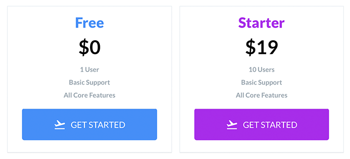
import { PricingCard } from 'react-native-elements';

<PricingCard
  color="#4f9deb"
  title="Free"
  price="$0"
  info={['1 User', 'Basic Support', 'All Core Features']}
  button={{ title: 'GET STARTED', icon: 'flight-takeoff' }}
/>;
Props
containerStylebuttonFontinfoFontpricingFonttitleFontwrapperStylepriceonButtonPressbuttoninfocolortitle
Reference
containerStyle
outer component styling (optional)
| Type | Default |
|---|---|
| object (style) | inherited styling |
infoStyle
specify pricing information style
| Type | Default |
|---|---|
| style (object) | none |
pricingStyle
specify pricing text style
| Type | Default |
|---|---|
| style (object) | none |
titleStyle
specify title text style
| Type | Default |
|---|---|
| style (object) | none |
wrapperStyle
inner wrapper component styling (optional)
| Type | Default |
|---|---|
| object (style) | inherited styling |
price
price (required)
| Type | Default |
|---|---|
| string | none |
onButtonPress
function to be run when button is pressed
| Type | Default |
|---|---|
| any | none |
button
button information (required)
| Type | Default |
|---|---|
| object {title, icon, buttonStyle, titleStyle} | none |
info
pricing information (optional)
| Type | Default |
|---|---|
| array of strings | none |
color
color scheme for button & title
| Type | Default |
|---|---|
| string | none |
title
title (required)
| Type | Default |
|---|---|
| string | none |