Avatar
Avatars are found all over ui design from lists to profile screens. They are commonly used to represent a user and can contain photos, icons, or even text.
Usage
import { Avatar } from 'react-native-elements';
// Standard Avatar
<Avatar
rounded
source={{
uri:
'https://s3.amazonaws.com/uifaces/faces/twitter/ladylexy/128.jpg',
}}
/>
// Avatar with Title
<Avatar rounded title="MD" />
// Avatar with Icon
<Avatar rounded icon={{ name: 'home' }} />
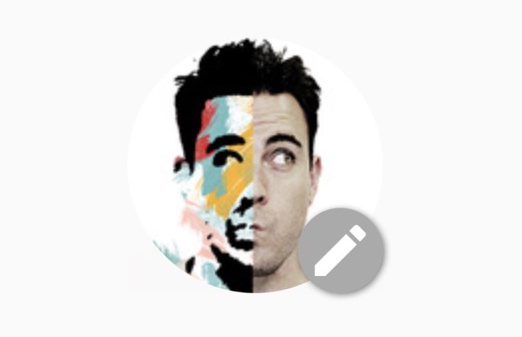
// Standard Avatar with edit button
<Avatar
source={{
uri:
'https://s3.amazonaws.com/uifaces/faces/twitter/adhamdannaway/128.jpg',
}}
showEditButton
/>
Avatar with initials
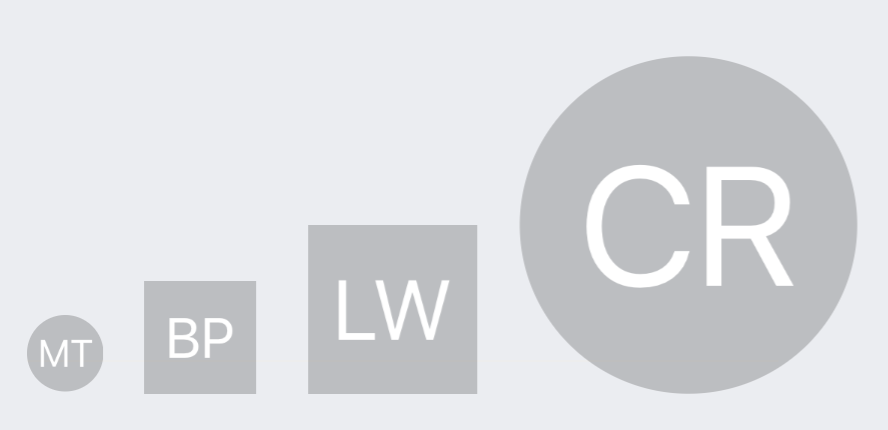
import { Avatar } from "react-native-elements";

<Avatar
  size="small"
  rounded
  title="MT"
  onPress={() => console.log("Works!")}
  activeOpacity={0.7}
/>
<Avatar
  size="medium"
  title="BP"
  onPress={() => console.log("Works!")}
  activeOpacity={0.7}
/>
<Avatar
  size="large"
  title="LW"
  onPress={() => console.log("Works!")}
  activeOpacity={0.7}
/>
<Avatar
  size="xlarge"
  rounded
  title="CR"
  onPress={() => console.log("Works!")}
  activeOpacity={0.7}
/>
Avatar with icons
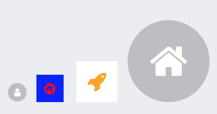
import { Avatar } from "react-native-elements";

<Avatar
  rounded
  icon={{name: 'user', type: 'font-awesome'}}
  onPress={() => console.log("Works!")}
  activeOpacity={0.7}
  containerStyle={{flex: 2, marginLeft: 20, marginTop: 115}}
/>
<Avatar
  size="small"
  rounded
  icon={{name: 'user', type: 'font-awesome'}}
  onPress={() => console.log("Works!")}
  activeOpacity={0.7}
  containerStyle={{flex: 2, marginLeft: 20, marginTop: 115}}
/>
<Avatar
  size="medium"
  overlayContainerStyle={{backgroundColor: 'blue'}}
  icon={{name: 'meetup', color: 'red', type: 'font-awesome'}}
  onPress={() => console.log("Works!")}
  activeOpacity={0.7}
  containerStyle={{flex: 3, marginTop: 100}}
/>
<Avatar
  size="large"
  icon={{name: 'rocket', color: 'orange', type: 'font-awesome'}}
  overlayContainerStyle={{backgroundColor: 'white'}}
  onPress={() => console.log("Works!")}
  activeOpacity={0.7}
  containerStyle={{flex: 4, marginTop: 75}}
/>
<Avatar
  size="xlarge"
  rounded
  icon={{name: 'home', type: 'font-awesome'}}
  onPress={() => console.log("Works!")}
  activeOpacity={0.7}
  containerStyle={{flex: 5, marginRight: 60}}
/>
<Avatar
  size={200}
  rounded
  icon={{name: 'user', type: 'font-awesome'}}
  onPress={() => console.log("Works!")}
  activeOpacity={0.7}
  containerStyle={{flex: 2, marginLeft: 20, marginTop: 115}}
/>
Avatar with title placeholder
import { ListItem } from 'react-native-elements';

<ListItem
  leftAvatar={{
    title: name[0],
    source: { uri: avatar_url },
    showEditButton: true,
  }}
  title={name}
  subtitle={role}
  chevron
/>;
Props
activeOpacityavatarStylecontainerStyleeditButtoniconiconStyleimagePropsonEditPressonLongPressonPressoverlayContainerStyleplaceholderStyleroundedsizeshowEditButtonsourcetitletitleStylerenderPlaceholderContentComponentImageComponent
Reference
activeOpacity
Opacity when pressed
| Type | Default |
|---|---|
| number | 0.2 |
avatarStyle
Style for avatar image
| Type | Default |
|---|---|
| object (style) | none |
containerStyle
Styling for outer container
| Type | Default |
|---|---|
| object (style) | none |
editButton
Icon props to be user for edit button
| Type | Default |
|---|---|
| {...Icon props} | { name: 'mode-edit', type: 'material', color: '#fff', underlayColor: '#000' } |
icon
Displays an icon as the main content of the Avatar. Cannot be used alongside
title. When used with the source prop it will be used as the placeholder.
| Type | Default |
|---|---|
| object {name: string, color: string, size: number, type: string (default is material, or choose from supported icon sets), iconStyle: object(style)} | none |
iconStyle
Extra styling for icon component (optional)
| Type | Default |
|---|---|
| object (style) | none |
imageProps
Optional properties to pass to the avatar e.g "resizeMode"
| Type | Default |
|---|---|
| {...Image props} | none |
onEditPress
Callback function when pressing on the edit button
| Type | Default |
|---|---|
| function | none |
onLongPress
Callback function when long pressing component
| Type | Default |
|---|---|
| function | none |
onPress
Callback function when pressing component
| Type | Default |
|---|---|
| function | none |
overlayContainerStyle
Style for the view outside image or icon
| Type | Default |
|---|---|
| object (style) | none |
placeholderStyle
Adds style to the placeholder wrapper
| Type | Default |
|---|---|
| object (style) | { backgroundColor: '#BDBDBD' } |
rounded
Makes the avatar circular
| Type | Default |
|---|---|
| boolean | false |
size
Size of the avatar
| Type | Default |
|---|---|
string(small, medium, large, xlarge) or number | small |
showEditButton
Shows an edit button over the avatar (optional)
| Type | Default |
|---|---|
| boolean | false |
source
Image source
| Type | Default |
|---|---|
| ImageSource | none |
title
Renders title in the placeholder
| Type | Default |
|---|---|
| string | none |
titleStyle
Style for the title
| Type | Default |
|---|---|
| object (style) | none |
renderPlaceholderContent
Custom placeholder element (by default, it's the title)
| Type | Default |
|---|---|
| React component or element | none |
Component
Component for enclosing element (eg: TouchableHighlight, View, etc)
| Type | Default |
|---|---|
| function | TouchableHighlight |
ImageComponent
Custom ImageComponent for Avatar
| Type | Default |
|---|---|
| React component or element | Image |