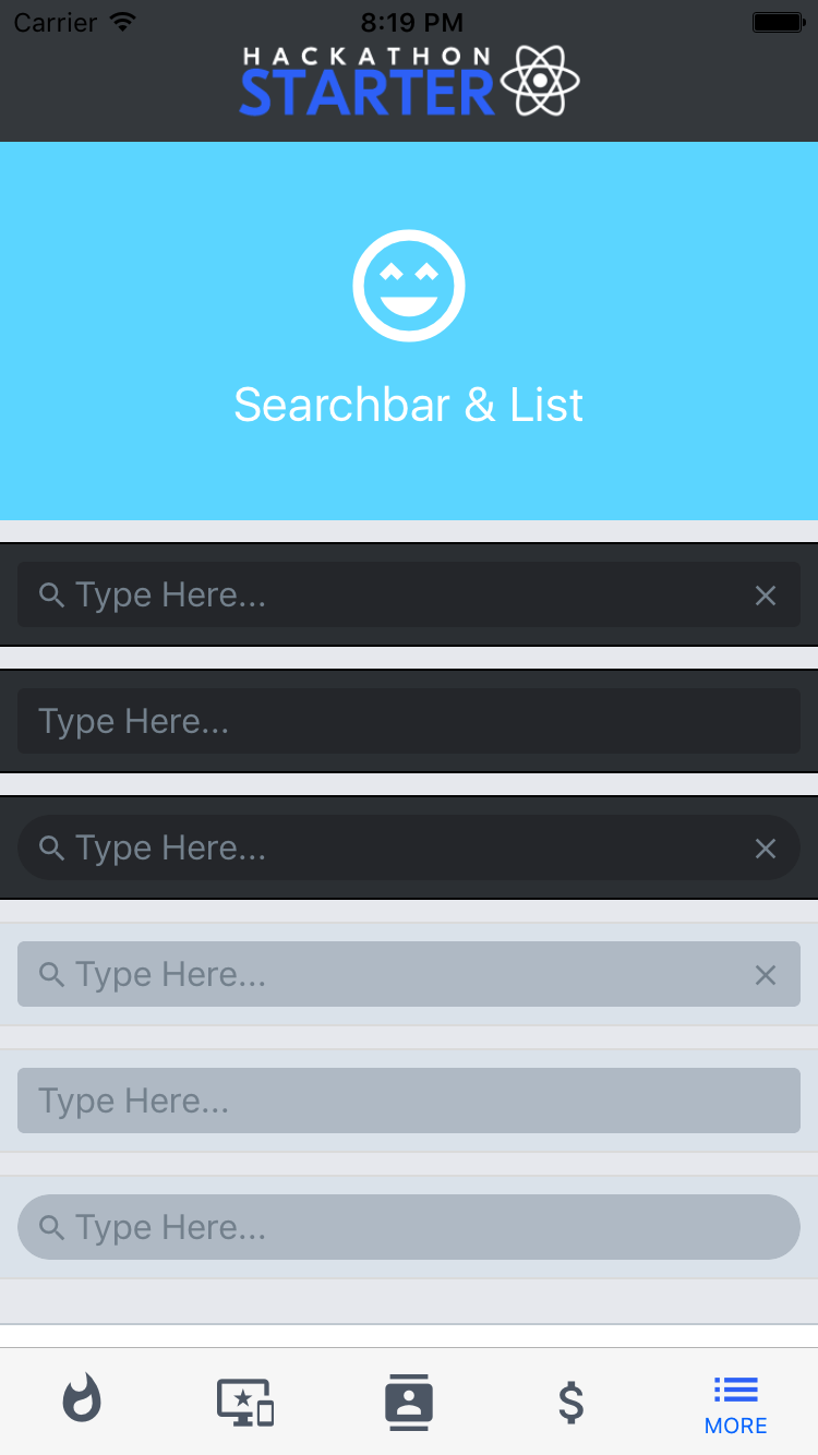
SearchBar
Import
import { SearchBar } from "@rneui/themed";
Usage
Default SearchBar

Platform specific SearchBar
iOS

Android

Interaction methods
| method | description |
|---|---|
| focus | call focus on the textinput (example) |
| blur | call blur on the textinput (example) |
| clear | call clear on the textinput (example) |
| cancel | (Android and iOS SearchBars only) call cancel on the SearchBar (left arrow on Android, Cancel button on iOS). This will basically blur the input and hide the keyboard (example) |
Calling methods on SearchBar
Store a reference to the SearchBar in your component by using the ref prop provided by React (see docs):
<SearchBar
  ref={search => this.search = search}
  ...
/>
You can then access SearchBar methods like so:
this.search.focus();
this.search.blur();
this.search.clear();
this.search.cancel(); // Only available if `platform` props is "ios" | "android"
Props
note
Includes all Input props.
| Name | Type | Default | Description |
|---|---|---|---|
cancelButtonProps | Text Style | ||
cancelButtonTitle | string | ||
cancelIcon | IconNode | ||
clearIcon | IconNode | Clear Icon | |
containerStyle | View Style | Style for container | |
inputContainerStyle | View Style | Style for input container | |
inputStyle | Text Style | Input Style | |
leftIconContainerStyle | View Style | Left Icon Container Style | |
lightTheme | boolean | ||
loadingProps | ActivityIndicatorProps | ActivityIndicatorProps | |
onCancel | (() => any) | (() => any) | ||
onClear | Function | ||
platform | default | android | ios | default | |
rightIconContainerStyle | View Style | Right Icon Container Style | |
round | boolean | ||
searchIcon | IconNode | Icon for search | |
showCancel | boolean | Show cancel | |
showLoading | boolean | Show loading |