Theme Provider
The previous solution works great for only one component, but imagine having to do this for every component you want custom styles for. That could get a bit tedious to manage. Thankfully, there's a better way to do this. React Native Elements ships with a 3 utilities for large-scale theming.
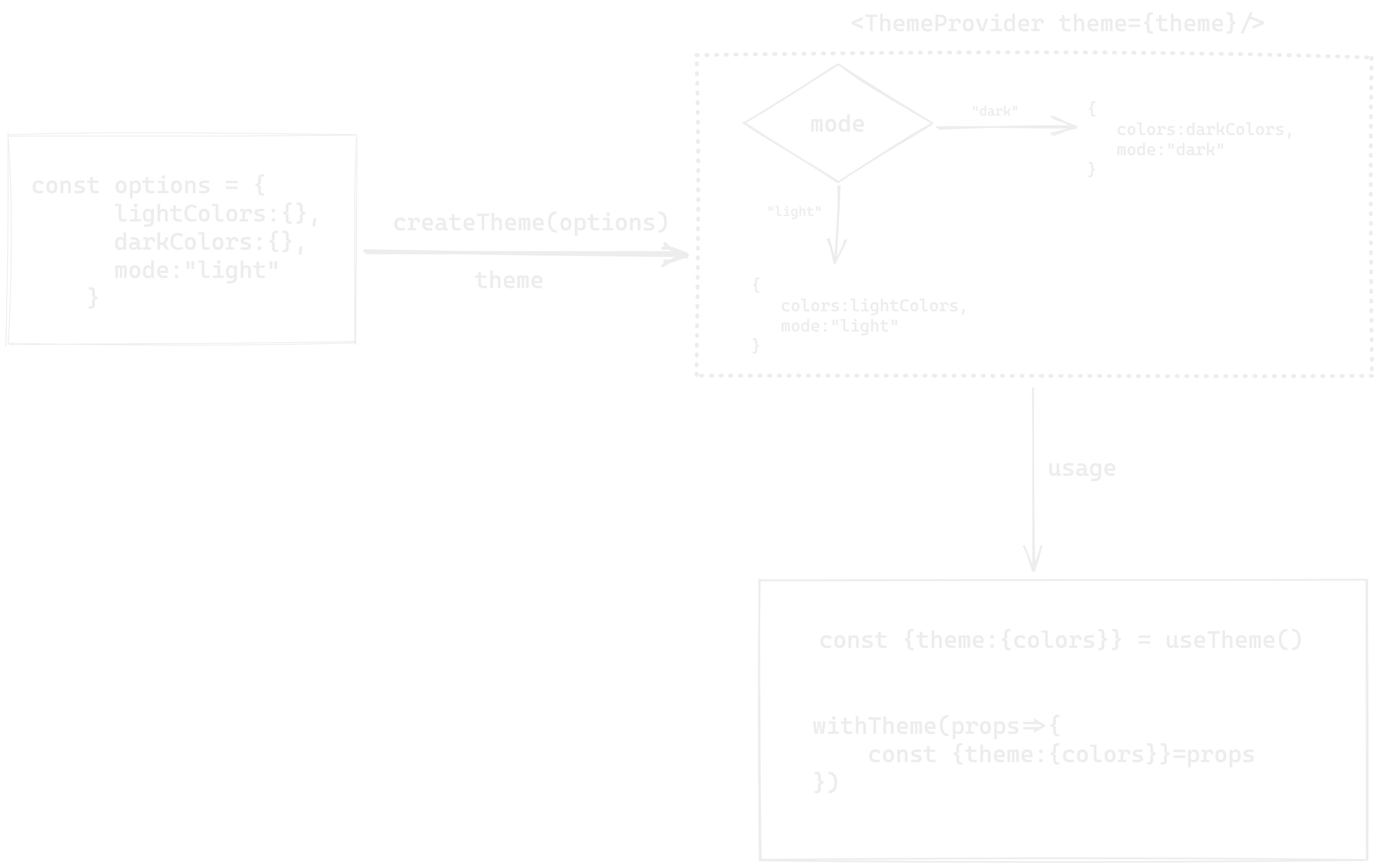
Firstly you'll want to set up your ThemeProvider.
Import
import { ThemeProvider } from '@rneui/themed';
Usage
Use createTheme to generate a theme object. Then, pass it as a prop to ThemeProvider.
const theme = createTheme({
  lightColors: {
    primary: 'red',
  },
  darkColors: {
    primary: 'blue',
  },
  components: {
    Button: {
      raised: true,
    },
  },
});

// Your App
const App = () => {
  return (
    <ThemeProvider theme={theme}>
      <Button>My Button</Button>
    </ThemeProvider>
  );
};
If you do not specify theme in ThemeProvider, it would use defaultTheme
Want to use custom color? refer extending colors
The example above achieves the same goals as the first example — apply the same
styles to multiple instances of Button in the app. However this example
applies the raised prop to every instance of Button inside the component
tree under ThemeProvider. Both of these buttons will have the raised prop
set to true.
This is extremely convenient and is made possible through React's Context API.
createTheme
Generate a theme base on the options received. Then, pass it as a prop to ThemeProvider.
createTheme({
  lightColors: Colors,
  darkColors: Colors,
  mode: 'light' | 'dark',
  components: {
    componentName: (props, theme) => ({
      // Props
    }),
  },
});
How it works

To theme subcomponents such as ListItem.Title, in your theme remove the dot and list them as "ListItemTitle"
useTheme
Hook returns theme, updateTheme & replaceTheme from ThemeProvider context or default theme if you did not wrap application with ThemeProvider.
import { useTheme } from '@rneui/themed';

function Demo() {
  const { theme, updateTheme } = useTheme();
  return (
    <View style={{ background: theme.colors.primary }}>
      <Button onPress={() => updateTheme({ colors: { primary: 'red' } })} />
    </View>
  );
}
The updateTheme function merges the theme passed in with the current theme.
updateTheme({
  lightColors: {
    primary: 'purple',
  },
});
The replaceTheme function merges the theme passed in with the default theme.
Want single-theme?
const theme = createTheme({
  // Use only one color scheme
  lightColors: {
    primary: 'red',
  },
  // And set that mode as default
  mode: 'light',
  components: {
    Button: {
      raised: true,
    },
  },
});

// Your App
const App = () => {
  return (
    <ThemeProvider theme={theme}>
      <Button>My Button</Button>
    </ThemeProvider>
  );
};
useThemeMode
You can get current theme mode (light or dark) and update it using setMode function from useThemeMode hook.
import { useThemeMode } from '@rneui/themed';

function Demo() {
  const { mode, setMode } = useThemeMode();

  return <Button onPress={() => setMode('dark')} title={mode} />;
}
withTheme
Function Signture
withTheme<Props>(Component, ?themeKey)
Usage
import { withTheme, ThemeProps } from '@rneui/themed';

type CustomComponentProps = {
  title: string;
  titleStyle: StyleProps<TextStyle>;
};

const CustomComponent = (props: ThemeProps<CustomComponentProps>) => {
  // Access theme from props
  const { theme, updateTheme, replaceTheme } = props;
  // ...
};

export default withTheme<CustomComponentProps>(CustomComponent, 'ComponentKey');
Don't want to wrap your components with withTheme? You can use the ThemeConsumer component
which uses render props!
Usage
import React from 'react';
import { Text } from 'react-native';
import { ThemeConsumer } from '@rneui/themed';

const MyComponent = () => (
  <ThemeConsumer>
    {({ theme }) => (
      <Text style={{ color: theme.colors.primary }}>Yo!</Text>;
    )}
  </ThemeConsumer>
)
More examples
Using with React Navigation
React Navigation uses it's own theming, you can use RNE UI's theme with it.
const Navigation = () => {
  const { theme } = useTheme();

  return (
    <NavigationContainer
      theme={{
        colors: {
          primary: theme.colors.primary,
          background: theme.colors.background,
          card: theme.colors.white,
          text: theme.colors.black,
        },
        dark: theme.mode === 'dark',
      }}
    >
      {/*  Navigators */}
    </NavigationContainer>
  );
};
const theme=createTheme({
  // ...
})

export const App = () => {
  return (
    <ThemeProvider theme={theme}>
      <Navigation>
    </ThemeProvider>
  );
};
Switch theme mode with useColorScheme
Usage
import { useColorScheme } from 'react-native';

const theme = createTheme({
  // ...
});

export const App = () => {
  theme.mode = useColorScheme();

  return (
    <ThemeProvider theme={theme}>
      {/*...*/}
      {/*...*/}
    </ThemeProvider>
  );
};
Theme mode based background color
const Background = ({ children }) => {
  const styles = useStyles();
  return <View style={styles.container}>{children}</View>;
};

const useStyles = makeStyles((theme) => ({
  container: {
    backgroundColor: theme.colors.background,
  },
}));
Usage
const theme = createTheme({
  // default mode
  mode: 'dark',
});

export default function App() {
  return (
    <ThemeProvider theme={theme}>
      <Background>
        {/*...*/}
        {/*...*/}
      </Background>
    </ThemeProvider>
  );
}