ListItem
ListItems are used to display rows of information, such as a contact list, playlist, or menu.
They are very customizable and can contain switches, avatars, badges, icons, and more.
Components
- ListItem.Accordion This allows making a accordion list which can show/hide content.
- ListItem.ButtonGroup This allows adding ButtonGroup to the ListItem. This, Receives all ButtonGroup props.
- ListItem.CheckBox This allows adding CheckBox to the ListItem. This, Receives all CheckBox props.
- ListItem.Chevron This allows adding a Chevron Icon(arrow) to the ListItem. This, Receives all Icon props.
- ListItem.Content This allows adding content to the ListItem. This, Receives all View props.
- ListItem.Input This allows adding an Text Input within the ListItem. This, Receives all Input props.
- ListItem.Subtitle This allows adding SubTitle to the ListItem. This, Receives all Text props.
- ListItem.Swipeable We offer a special kind of ListItem which is swipeable from both ends and allows users select an event.
- ListItem.Title This allows adding Title to the ListItem. This, Receives all Text props.
Usage
Using Map Function - Implemented with avatar
import { ListItem, Avatar } from 'react-native-elements'

const list = [
  {
    name: 'Amy Farha',
    avatar_url: 'https://s3.amazonaws.com/uifaces/faces/twitter/ladylexy/128.jpg',
    subtitle: 'Vice President'
  },
  {
    name: 'Chris Jackson',
    avatar_url: 'https://s3.amazonaws.com/uifaces/faces/twitter/adhamdannaway/128.jpg',
    subtitle: 'Vice Chairman'
  },
  ... // more items
]

<View>
  {
    list.map((l, i) => (
      <ListItem key={i} bottomDivider>
        <Avatar source={{uri: l.avatar_url}} />
        <ListItem.Content>
          <ListItem.Title>{l.name}</ListItem.Title>
          <ListItem.Subtitle>{l.subtitle}</ListItem.Subtitle>
        </ListItem.Content>
      </ListItem>
    ))
  }
</View>
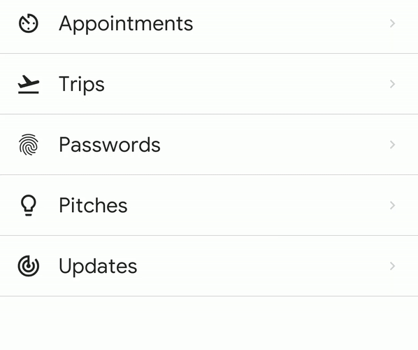
Using Map Function - Implemented with link and icon
import { ListItem, Icon } from 'react-native-elements'

const list = [
  {
    title: 'Appointments',
    icon: 'av-timer'
  },
  {
    title: 'Trips',
    icon: 'flight-takeoff'
  },
  ... // more items
]

<View>
  {
    list.map((item, i) => (
      <ListItem key={i} bottomDivider>
        <Icon name={item.icon} />
        <ListItem.Content>
          <ListItem.Title>{item.title}</ListItem.Title>
        </ListItem.Content>
        <ListItem.Chevron />
      </ListItem>
    ))
  }
</View>
Using RN FlatList - Implemented with link and avatar
import { ListItem, Avatar } from 'react-native-elements'

const list = [
  {
    name: 'Amy Farha',
    avatar_url: 'https://s3.amazonaws.com/uifaces/faces/twitter/ladylexy/128.jpg',
    subtitle: 'Vice President'
  },
  {
    name: 'Chris Jackson',
    avatar_url: 'https://s3.amazonaws.com/uifaces/faces/twitter/adhamdannaway/128.jpg',
    subtitle: 'Vice Chairman'
  },
  ... // more items
]

keyExtractor = (item, index) => index.toString()

renderItem = ({ item }) => (
  <ListItem bottomDivider>
    <Avatar source={{uri: item.avatar_url}} />
    <ListItem.Content>
      <ListItem.Title>{item.name}</ListItem.Title>
      <ListItem.Subtitle>{item.subtitle}</ListItem.Subtitle>
    </ListItem.Content>
    <ListItem.Chevron />
  </ListItem>
)

render () {
  return (
    <FlatList
      keyExtractor={this.keyExtractor}
      data={list}
      renderItem={this.renderItem}
    />
  )
}
Using RN FlatList - Implemented with custom avatar component.
import { ListItem, Avatar } from 'react-native-elements'

const list = [
  {
    name: 'Amy Farha',
    subtitle: 'Vice President'
  },
  {
    name: 'Chris Jackson',
    avatar_url: 'https://s3.amazonaws.com/uifaces/faces/twitter/adhamdannaway/128.jpg',
    subtitle: 'Vice Chairman'
  },
  ... // more items
]

keyExtractor = (item, index) => index.toString()

renderItem = ({ item }) => (
  <ListItem bottomDivider >
    <Avatar title={item.name[0]} source={item.avatar_url && { uri: item.avatar_url }}/>
    <ListItem.Content>
      <ListItem.Title>{item.name}</ListItem.Title>
      <ListItem.Subtitle>{item.subtitle}</ListItem.Subtitle>
    </ListItem.Content>
    <ListItem.Chevron />
  </ListItem>
)

render () {
  return (
    <FlatList
      keyExtractor={this.keyExtractor}
      data={list}
      renderItem={this.renderItem}
    />
  )
}
ListItem implemented with custom View for Subtitle
import { ListItem, Avatar } from 'react-native-elements'

render () {
  return (
    <ListItem>
      <ListItem.Content>
        <ListItem.Title>Limited supply! Its like digital gold!</ListItem.Title>
        <View style={styles.subtitleView}>
          <Image source={require('../images/rating.png')} style={styles.ratingImage}/>
          <Text style={styles.ratingText}>5 months ago</Text>
        </View>
      </ListItem.Content>
    </ListItem>
  )
}

styles = StyleSheet.create({
  subtitleView: {
    flexDirection: 'row',
    paddingLeft: 10,
    paddingTop: 5
  },
  ratingImage: {
    height: 19.21,
    width: 100
  },
  ratingText: {
    paddingLeft: 10,
    color: 'grey'
  }
})
Badges
Example badge usage
<ListItem>
  <Badge
    value={3}
    textStyle={{ color: 'orange' }}
    containerStyle={{ marginTop: -20 }}
  />
</ListItem>
Linear gradient + Scale feedback

import { ListItem, Avatar } from 'react-native-elements';
import TouchableScale from 'react-native-touchable-scale'; // https://github.com/kohver/react-native-touchable-scale
import LinearGradient from 'react-native-linear-gradient'; // Only if no expo

<ListItem
  Component={TouchableScale}
  friction={90} //
  tension={100} // These props are passed to the parent component (here TouchableScale)
  activeScale={0.95} //
  linearGradientProps={{
    colors: ['#FF9800', '#F44336'],
    start: { x: 1, y: 0 },
    end: { x: 0.2, y: 0 },
  }}
  ViewComponent={LinearGradient} // Only if no expo
>
  <Avatar rounded source={{ uri: avatar_url }} />
  <ListItem.Content>
    <ListItem.Title style={{ color: 'white', fontWeight: 'bold' }}>
      Chris Jackson
    </ListItem.Title>
    <ListItem.Subtitle style={{ color: 'white' }}>
      Vice Chairman
    </ListItem.Subtitle>
  </ListItem.Content>
  <ListItem.Chevron color="white" />
</ListItem>;
ListItem Accordion
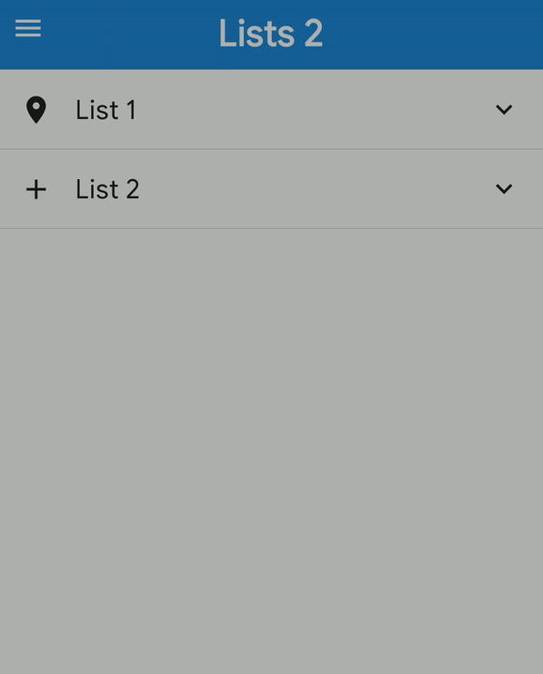
<ListItem.Accordion
  content={
    <>
      <Icon name="place" size={30} />
      <ListItem.Content>
        <ListItem.Title>List Accordion</ListItem.Title>
      </ListItem.Content>
    </>
  }
  isExpanded={expanded}
  onPress={() => {
    setExpanded(!expanded);
  }}
>
  {list2.map((l, i) => (
    <ListItem key={i} onPress={log} bottomDivider>
      <Avatar title={l.name[0]} source={{ uri: l.avatar_url }} />
      <ListItem.Content>
        <ListItem.Title>{l.name}</ListItem.Title>
        <ListItem.Subtitle>{l.subtitle}</ListItem.Subtitle>
      </ListItem.Content>
      <ListItem.Chevron />
    </ListItem>
  ))}
</ListItem.Accordion>
ListItem Swipeable
<ListItem.Swipeable
  leftContent={
    <Button
      title="Info"
      icon={{ name: 'info', color: 'white' }}
      buttonStyle={{ minHeight: '100%' }}
    />
  }
  rightContent={
    <Button
      title="Delete"
      icon={{ name: 'delete', color: 'white' }}
      buttonStyle={{ minHeight: '100%', backgroundColor: 'red' }}
    />
  }
>
  <Icon name="My Icon" />
  <ListItem.Content>
    <ListItem.Title>Hello Swiper</ListItem.Title>
  </ListItem.Content>
  <ListItem.Chevron />
</ListItem.Swipeable>
Props
ListItem
- Component
- ViewComponent
- bottomDivider
- children
- containerStyle
- disabledStyle
- linearGradientProps
- pad
- topDivider
ListItem.Accordion
ListItem.ButtonGroup
ListItem.CheckBox
None
ListItem.Chevron
ListItem.Content
ListItem.Input
None
ListItem.Subtitle
ListItem.Swipeable
ListItem.Title
Reference
ListItem
Component
Replace element with custom element.
| Type | Default |
|---|---|
| React Component | None |
ViewComponent
Container for linear gradient.
| Type | Default |
|---|---|
| React Component | None |
bottomDivider
Add divider at the bottom of the list item.
| Type | Default |
|---|---|
| boolean | None |
children
Either children or a render prop that receives a boolean reflecting whether
the component is currently pressed.
Add enclosed children.
| Type | Default |
|---|---|
| any | None |
containerStyle
Additional main container styling.
| Type | Default |
|---|---|
| View style(Object) | None |
disabledStyle
Specific styling to be used when list item is disabled.
| Type | Default |
|---|---|
| View style(Object) | None |
linearGradientProps
Props for linear gradient component.
| Type | Default |
|---|---|
| any | None |
pad
Adds spacing between the leftComponent, the title component & right component.
| Type | Default |
|---|---|
| number | None |
topDivider
Add divider at the top of the list item.
| Type | Default |
|---|---|
| boolean | None |
ListItem.Accordion
animation
Decide whether to show animation.
| Type | Default |
|---|---|
| Boolean or Object | { |
  duration: 350,
  type: 'timing',
} |
content
Similar to ListItem's child.
| Type | Default |
|---|---|
| any | None |
expandIcon
Icon when Accordion is expanded, if not provided icon will be rotated 180deg.
| Type | Default |
|---|---|
| any | None |
icon
Icon for unexpanded Accordion.
| Type | Default |
|---|---|
| any | None |
isExpanded
Decide if Accordion is Expanded.
| Type | Default |
|---|---|
| boolean | None |
noIcon
Don't show accordion icon.
| Type | Default |
|---|---|
| boolean | None |
noRotation
Don't rotate when Accordion is expanded.
| Type | Default |
|---|---|
| boolean | None |
ListItem.ButtonGroup
pressableProps
| Type | Default |
|---|---|
| Omit<PressableProps, "onPress" or "onLongPress" or "onPressIn" or "onPressOut"> | None |
ListItem.CheckBox
None
ListItem.Chevron
pressableProps
| Type | Default |
|---|---|
| Omit<PressableProps, "onPress" or "onLongPress" or "onPressIn" or "onPressOut"> | None |
ListItem.Content
right
| Type | Default |
|---|---|
| boolean | None |
ListItem.Input
None
ListItem.Subtitle
right
| Type | Default |
|---|---|
| boolean | None |
ListItem.Swipeable
leftContent
Left Content.
| Type | Default |
|---|---|
| any | None |
leftStyle
Style of left container.
| Type | Default |
|---|---|
| View style(Object) | None |
leftWidth
Width to swipe left.
| Type | Default |
|---|---|
| number | ScreenWidth / 3 |
onLeftSwipe
Function to call when user swipes left.
| Type | Default |
|---|---|
| Function | None |
onRightSwipe
Function to call when user swipes right.
| Type | Default |
|---|---|
| Function | None |
rightContent
Right Content.
| Type | Default |
|---|---|
| any | None |
rightStyle
Style of right container.
| Type | Default |
|---|---|
| View style(Object) | None |
rightWidth
Width to swipe right.
| Type | Default |
|---|---|
| number | ScreenWidth / 3 |
ListItem.Title
right
Add right title.
| Type | Default |
|---|---|
| boolean | None |