Circular Slider
This is a
react-native-elements-universecomponent
Sliders allow users to make selections from a range of values.
Usage
import { CircularSlider } from 'react-native-elements-universe';
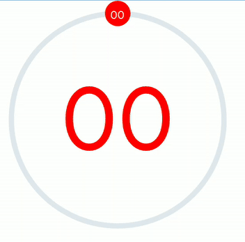
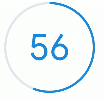
<CircularSlider value={value} onChange={setValue} />;
<CircularSlider value={value} noThumb />;
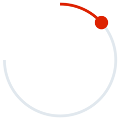
// 90 deg Arc
<CircularSlider maxAngle={90} />;
Either use percentage (0 to 100) in
valueor specifymaximumValue&minimumValue
Props
valuemaximumValueminimumValuemaxAngleminAngletrackRadiusthumbRadiustrackWidthtrackColorthumbColortrackTintColorthumbTextColorthumbTextSizenoThumbshowTextshowThumbTexttextColortextSize
Reference
value
Value of Slider
| Type | Default |
|---|---|
| number | 100 |
maximumValue
Maximum value of Slider
| Type | Default |
|---|---|
| number | 100 |
minimumValue
Minimum value of Slider
| Type | Default |
|---|---|
| number | 0 |
minAngle
Minimum angle of arc (in degrees)
| Type | Default |
|---|---|
| number | 0 |
maxAngle
Maximum angle of arc (in degress)
| Type | Default |
|---|---|
| number | 359.9 |
trackRadius
Radius of Circular Slider
| Type | Default |
|---|---|
| number | 100 |
thumbRadius
Radius of Circular Slider's thumb
| Type | Default |
|---|---|
| number | 12 |
trackWidth
Width of Circular Slider
| Type | Default |
|---|---|
| number | 5 |
trackColor
Color of track
| Type | Default |
|---|---|
| color string | theme primary color |
thumbColor
color of thumb
| Type | Default |
|---|---|
| color string | trackColor's value |
trackTintColor
Tint Color of track
| Type | Default |
|---|---|
| color string | theme.primary.gray5 |
thumbTextColor
Marker Text of thumb color
| Type | Default |
|---|---|
| color string | white |
thumbTextSize
Marker Text of thumb Size
| Type | Default |
|---|---|
| number | 10 |
noThumb
Show no thumb (for progress)
| Type | Default |
|---|---|
| boolean | false |
showText
Show slider value at middle of slider
| Type | Default |
|---|---|
| boolean | false |
showThumbText
Show value at thumb
| Type | Default |
|---|---|
| boolean | false |
textColor
Slider value at middle of slider color
| Type | Default |
|---|---|
| color string | trackColor value |
textSize
Slider value at middle of slider font size
| Type | Default |
|---|---|
| number | 100 |