input
Props
This component inherits all native TextInput props that come with a standard React Native TextInput element, along with the following:
containerStyledisableddisabledInputStyleerrorMessageerrorPropserrorStyleInputComponentinputContainerStyleinputStylelabellabelPropslabelStyleleftIconleftIconContainerStylerenderErrorMessagerightIconrightIconContainerStyle
Reference
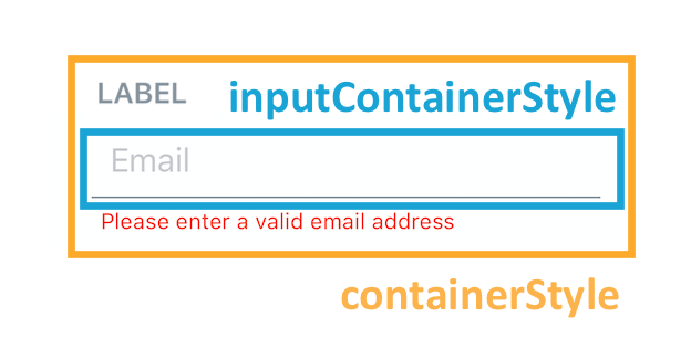
containerStyle
styling for view containing the label, the input and the error message
| Type | Default |
|---|---|
| View style (object) | none |
disabled
disables the input component
| Type | Default |
|---|---|
| boolean | false |
disabledInputStyle
disabled styles that will be passed to the style props of the React Native TextInput (optional)
| Type | Default |
|---|---|
| Text style (object) | none |
errorMessage
adds error message (optional)
| Type | Default |
|---|---|
| string | none |
errorProps
props to be passed to the React Native Text component used to display the
error message (optional)
| Type | Default |
|---|---|
| {...Text props} | none |
errorStyle
add styling to error message (optional)
| Type | Default |
|---|---|
| object | none |
InputComponent
component that will be rendered in place of the React Native TextInput
(optional)
| Type | Default |
|---|---|
| React Native Component | TextInput |
inputContainerStyle
styling for Input Component Container (optional)
| Type | Default |
|---|---|
| View style (object) | none |
inputStyle
style that will be passed to the style props of the React Native TextInput
(optional)
| Type | Default |
|---|---|
| object | none |
label
add a label on top of the input (optional)
| Type | Default |
|---|---|
| string OR React element or component | none |
labelProps
props to be passed to the React Native Text component used to display the
label or React Component used instead of simple string in label prop
(optional)
| Type | Default |
|---|---|
| {...Text props} OR passed component props | none |
labelStyle
styling for the label (optional); You can only use this if label is a string
| Type | Default |
|---|---|
| object | none |
leftIcon
displays an icon on the left (optional)
| Type | Default |
|---|---|
| {...Icon props} OR component | none |
leftIconContainerStyle
styling for left Icon Component container
| Type | Default |
|---|---|
| View style (object) | none |
placeholder
Placeholder text for the input
| Type | Default |
|---|---|
| string | none |
renderErrorMessage
If the error message container should be rendered (take up vertical space). If false, when showing errorMessage, the layout will shift to add it at that time.
| Type | Default |
|---|---|
| boolean | true |
rightIcon
displays an icon on the right (optional)
| Type | Default |
|---|---|
| {...Icon props} OR component | none |
rightIconContainerStyle
styling for right Icon Component container
| Type | Default |
|---|---|
| View style (object) | none |
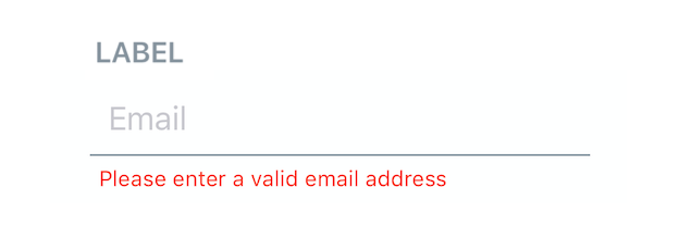
Styles explanation
| Input with a label and an error message | Styles explanation |
|---|---|
 |  |