Dialog
Dialogs inform users about a task and can contain critical information, require decisions, or involve multiple tasks. You can wrap any component with a simple Dialog component to display quick information to the user.

Usage
import React, { useState } from 'react';
import { View, Text } from 'react-native';
import { Dialog, Button } from 'react-native-elements';
const DialogExample = () => {
const [visible1, setVisible1] = useState(false);
const [visible2, setVisible2] = useState(false);
const [visible3, setVisible3] = useState(false);
const toggleDialog1 = () => {
setVisible1(!visible1);
};
const toggleDialog2 = () => {
setVisible2(!visible2);
};
const toggleDialog3 = () => {
setVisible3(!visible3);
};
return (
<View>
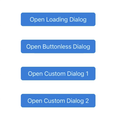
<Button title="Open Simple Dialog" onPress={toggleDialog1} />
<Button
title="Open Mutli Action Dialog"
onPress={toggleDialog2}
buttonStyle={styles.button}
/>
<Button
title="Open Loading Dialog"
onPress={toggleDialog3}
buttonStyle={styles.button}
/>
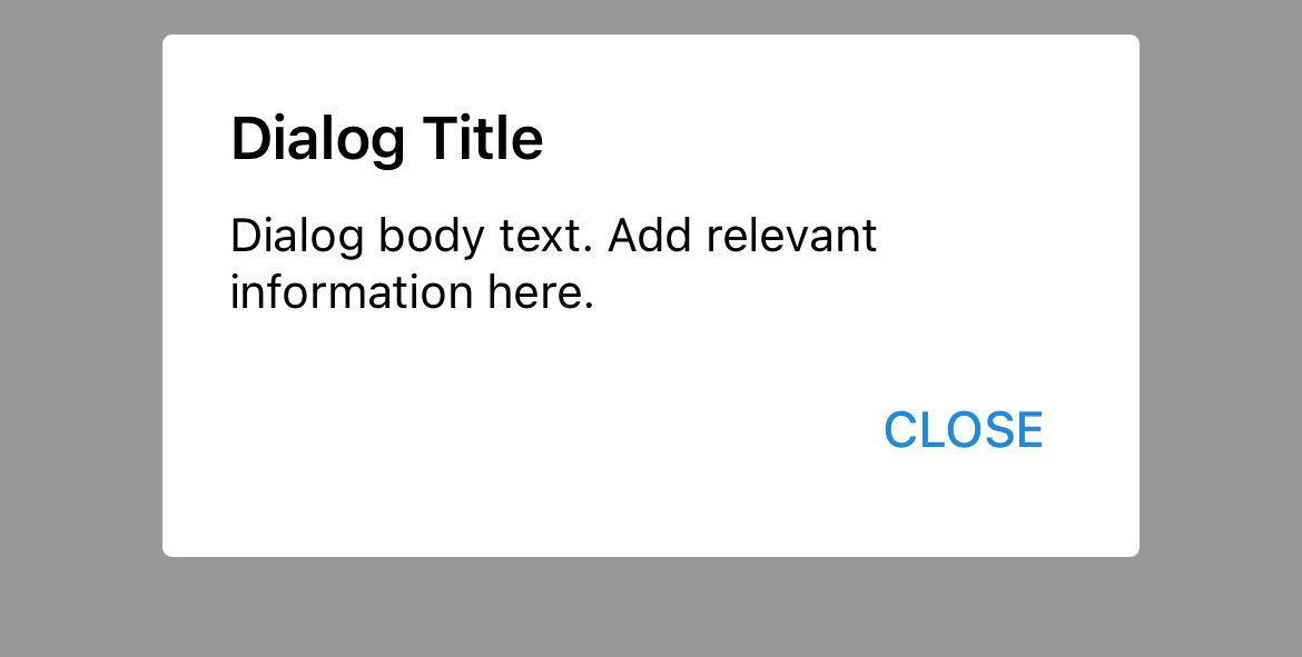
// Simple Dialog
<Dialog isVisible={visible1} onBackdropPress={toggleDialog1}>
<Dialog.Title title="Dialog Title" />
<Text>Dialog body text. Add relevant information here.</Text>
</Dialog>
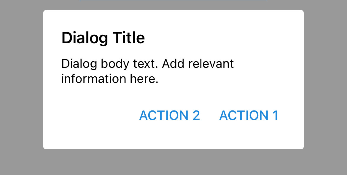
// Multi-Action Dialog
<Dialog isVisible={visible2} onBackdropPress={toggleDialog2}>
<Dialog.Title title="Dialog Title" />
<Text>Dialog body text. Add relevant information here.</Text>
<Dialog.Actions>
<Dialog.Button
title="ACTION 1"
onPress={() => console.log('Primary Action Clicked!')}
/>
<Dialog.Button
title="ACTION 2"
onPress={() => console.log('Secondary Action Clicked!')}
/>
</Dialog.Actions>
</Dialog>
// Loading Dialog
<Dialog isVisible={visible3} onBackdropPress={toggleDialog3}>
<Dialog.Loading />
</Dialog>
</View>
);
};
Web-platform specific note:
You must pass a valid React Native
Modalcomponent implementation intoModalComponentprop becauseModalcomponent is not implemented yet inreact-native-web
...
import Modal from 'modal-react-native-web';

...

<Dialog ModalComponent={Modal} ... />
...
Props
Also receives all Overlay props except
fullscreen
Child Components
Dialog.Title
Dialog.Loading
Dialog.Actions
Dialog.Button
Receives all Button props.
Reference
isVisible
If true, the dialog is visible
| Type | Default |
|---|---|
| boolean | false |
loadingStyle
Add additional styling for loading component (optional)
| Type | Default |
|---|---|
| View style (object) | Internal Style |
loadingProps
Add additional props for ActivityIndicator component (optional)
| Type | Default |
|---|---|
| {...ActivityIndicator props} | Internal object |
title
Dialog title (optional)
| Type | Default |
|---|---|
| string | none |
titleStyle
Add additional styling for title component (optional)
| Type | Default |
|---|---|
| Text style (object) | none |
titleProps
Add additional props for Text component (optional)
| Type | Default |
|---|---|
| {...Text props} | none |
onBackdropPress
Handler for backdrop press
| Type | Default |
|---|---|
| function | none |
overlayStyle
Add dditional styling to the internal Overlay component (optional)
| Type | Default |
|---|---|
| View Style (object) | Internal Style |
theme
Provides a theme to the dialog. (optional)
| Type | Default |
|---|---|
| string | Theme(Primary) |
children
Enclosed components. (optional)
| Type | Default |
|---|---|
| React Element | none |